Create Great Graphs Easily (+Bonus)


You will learn to master graph creation using iNZight, a free, user-friendly software offering many chart types and inferential analysis options.
Are you grappling with selecting and creating appropriate graphs for your data? If so, we have the answer for you! Mastering the art of crafting compelling graphs has become a fundamental skill in various domains.
Commonly, individuals encounter significant challenges when generating their charts, including determining the appropriate chart type, choosing the right software, and understanding the steps involved in creating the chart.
Peruse this article to discover free, user-friendly software that will address many of your graph-creation concerns unequivocally.
A well-constructed graph simplifies the interpretation of the data you aim to present. The significance of this skill for professional success across multiple fields, particularly academia, is undeniable.
Many graph types exist, including scatter plots, bar/column plots, pie charts, and line graphs. But when and how should each be used?
Introducing iNZight, a free software solution that will undoubtedly alleviate many of your dilemmas concerning selecting and creating various graph types.
iNZight was initially developed by New Zealand students for local use. However, the project has grown and is now freely available for anyone to download and use globally.
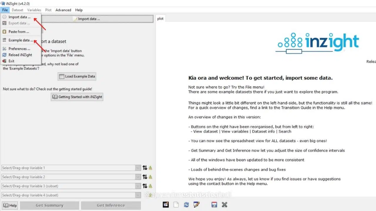
Firstly, download the iNZight software here. It’s available for Windows, Mac, and Linux (click here). The installation process is a breeze. Execute the downloaded file and click the “Install” button.
Upon completion, an iNZight icon will be created on your desktop. The software allows for importing spreadsheets from Excel, SPSS, and more.
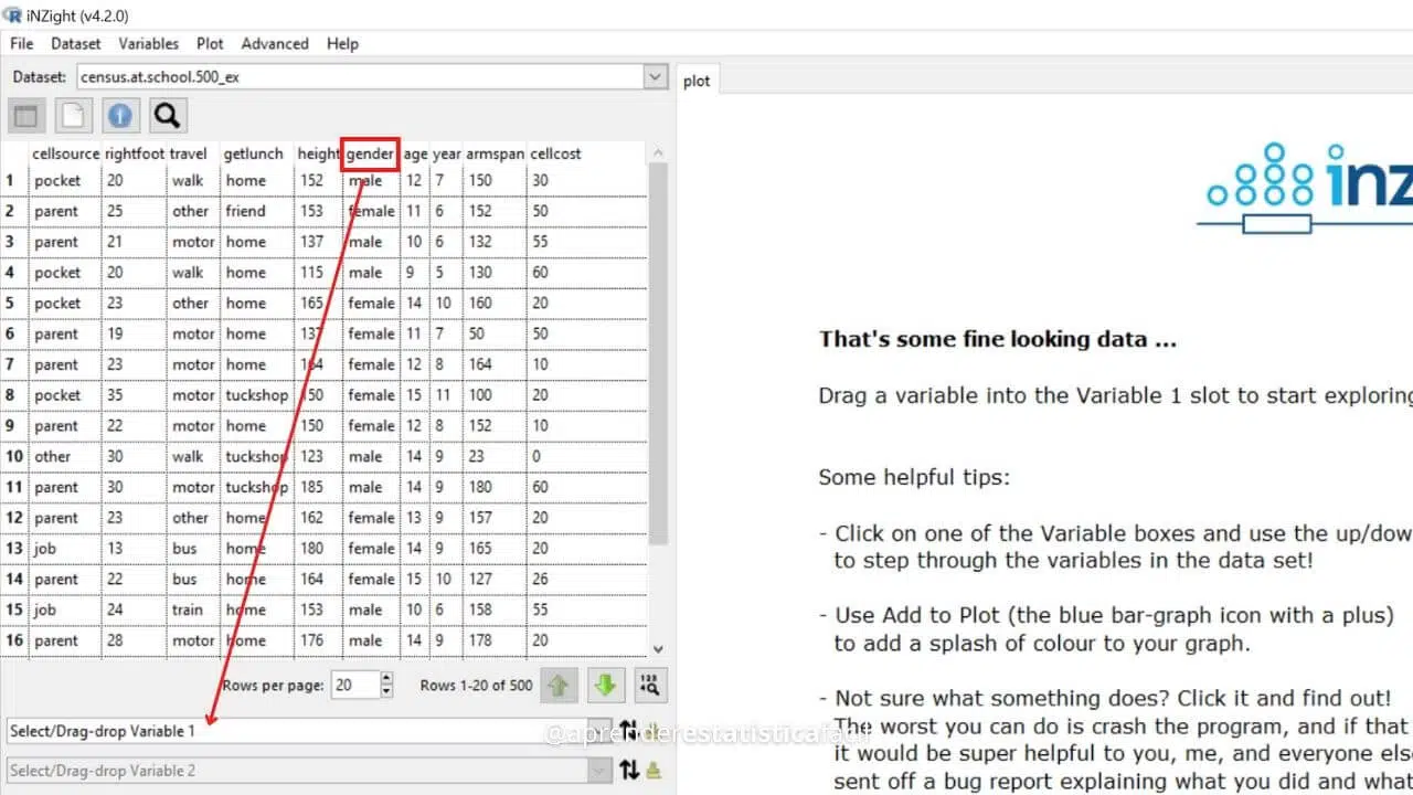
Exploring iNZight: iNZight conveniently comes with several example data files. In this article, we’ll use iNZight’s school census example data.
One crucial tip is to thoughtfully create and organize your spreadsheet, ensuring each variable is in a column and each sample in a row.
The software’s operation is straightforward and intuitive. So you drag the variable you wish to represent from the column top to the appropriate spaces. For instance, I’ve dragged the gender variable to the Variable 1 field.
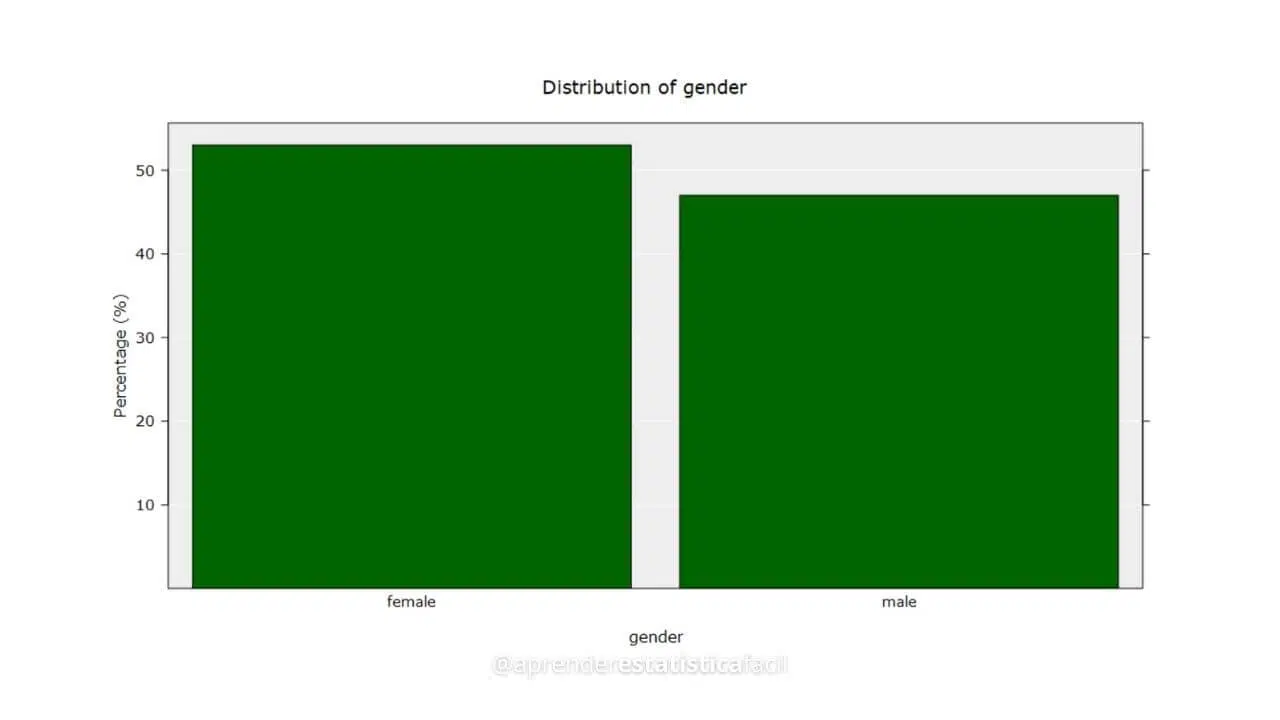
Since gender is a qualitative variable, it creates a bar/column chart displaying the proportion of each of the two genders.
Experimenting with the available variables in different combinations will result in iNZight automatically generating graphs based on the variable types.
The possible graphs stem from the following variable combinations:
When representing one qualitative variable, dragging it to the Variable 1 field auto-generates a bar/column chart displaying each group’s frequency (percentage).
Examples of this variable type include gender, profession, marital status, educational level, species, types of investments, etc.
This graph serves as a replacement for pie/sector graphs.
To represent a single quantitative variable, iNZight creates a dot plot accompanied by a box plot.
Examples of this variable type include age, weight, height, time, distance, temperature, etc.
This graph serves as a replacement for histograms.
By dragging two qualitative variables into the Variable 1 and Variable 2 fields, the software creates a multi-column chart comparing the frequencies.
Dragging one qualitative variable into the Variable 1 field and one quantitative variable into the Variable 2 field creates a comparative graph, with dots representing observations and the box plot signifying summary measures.
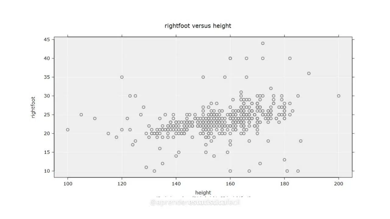
By selecting two quantitative variables, you can create a scatterplot.
All graphs offer export and customization options, such as adjusting font size, color, and symbol size.
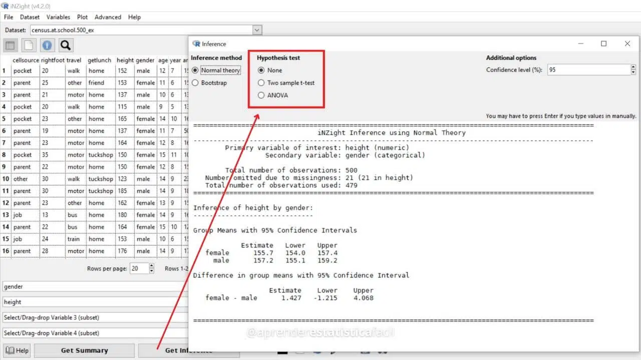
To sweeten the deal, iNZight offers inferential analysis capabilities directly from the graph, including t-tests and ANOVA. Once the desired variables have been allocated in the fields, click the “Get Inference” button to open the inferential analysis box.
To learn more about t-tests and ANOVA, check out these resources on t-test here and ANOVA here!
The iNZight software, built on the robust open-source R package, is an outstanding choice for quickly and effortlessly preparing various graphs.
We highly recommend downloading, installing, and exploring iNZight to discover its graphing capabilities and even perform a few inferential tests.
For further tips on graphing, we invite you to read our comprehensive article, “Simple and effective method for defining the best type of graph to represent your data.”

Explore the depths of Cramer’s V for analyzing categorical data relationships in our guide, complete with R and Python applications.

Master Generalized Linear Models in Python with our in-depth guide, unlocking powerful data analysis techniques for insightful discoveries.

Explore the pivotal role of Link Functions in Generalized Linear Models to enhance your data analysis and model accuracy.
Statistics are like bikinis: revealing crucial data insights and acknowledging hidden aspects for a balanced data interpretation approach.
Dive into the world of convenience sampling! Understand its pros, cons, and best practices in our comprehensive guide.

Explore the risks of unethical data analysis — ‘If you torture the data long enough, it will confess to anything’ — Learn best practices.