Scatterplot Mastery: Unveiling Patterns in Data Visualization
You will learn the transformative power of the scatterplot in revealing hidden data stories.
Introduction
In data visualization, the scatterplot stands out for its simplicity and profundity. At first glance, it presents a mere collection of points spread across a two-dimensional plane. Yet, upon closer examination, it reveals a rich tapestry of relationships, trends, and insights hidden within raw data. Scatterplots’ inherent beauty and elegance are not just in their visual appeal but in their ability to cut through the noise, providing clarity and insight where there was once obscurity.
By design, the scatterplot is a powerful tool in the data analyst’s arsenal, enabling the discernment of correlations between variables with a straightforwardness unmatched by more complex visualizations. In this simplicity, its true power lies; each point plotted on the graph tells a part of the story, contributing to a broader narrative about the data being examined. The scatterplot does not just display data; it unveils the underlying truth, allowing us to see the world as it is, not just as it appears.
Furthermore, the role of scatterplots in achieving clarity and insight cannot be overstated. They bridge raw data and actionable knowledge, transforming abstract numbers into visual patterns the human mind can readily comprehend and analyze. This transformation is not merely a technical exercise but an art form, blending the rigor of statistical analysis with the creativity of design. In crafting scatterplots, one undertakes a journey from data to wisdom, guided by principles that seek to inform and enlighten.
In this article, we embark on a comprehensive exploration of scatterplots. From their essence and anatomy to their creation, interpretation, and advanced techniques, we will delve into how these simple yet powerful visual tools enable us to uncover the hidden stories within our data. By the end of this journey, you will have mastered the technical skills required to create and interpret scatterplots and appreciate their role in the pursuit of truth in data analysis.
Highlights
- Scatterplots unveil correlations between variables, clarifying complex data relationships.
- Outliers become evident in scatterplots, guiding deeper data investigation.
- Scatterplots aid in forecasting trends through visual data clusters.
- Effective scatterplot design enhances data storytelling, making insights accessible.
- Advanced scatterplot techniques reveal multidimensional data insights, broadening analysis scope.
Ad Title
Ad description. Lorem ipsum dolor sit amet, consectetur adipiscing elit.
The Essence of a Scatterplot
At its core, a scatterplot is a graphical representation that uses Cartesian coordinates to display values for typically two variables within a data set. By plotting each data point individually on a two-dimensional plane, scatterplots allow for the visualization of how one variable is related to another, making it a fundamental tool in statistics and data science for identifying and illustrating correlations.
The genesis of scatterplots can be traced back to the early 19th century, with Francis Galton’s work on regression and correlation serving as a pivotal moment in their development. Galton’s introduction of the scatterplot to visualize the relationship between different sets of measurements laid the groundwork for what would become an indispensable statistical tool. This historical context underscores the longevity of scatterplots and their intrinsic value in extracting the inherent truth from data sets. Over the years, as the discipline of data visualization evolved, so too did the applications and complexity of scatterplots, adapting to the ever-expanding needs of data analysis.
The enduring value of scatterplots in revealing the inherent truth in data sets lies in their ability to provide clear, visual evidence of the relationship between variables. This is particularly crucial in an era where data is abundant, and the quest for empirical evidence in decision-making is paramount. Scatterplots serve as a beacon, guiding analysts through the fog of complex data to uncover underlying patterns and relationships that might otherwise remain obscured.
In their simplicity, scatterplots embody the convergence of art and science — presenting data in a format that is not only informative but also aesthetically pleasing. This duality enhances their utility, making scatterplots not just tools for analysis but also instruments of storytelling, capable of conveying the narratives hidden within data in a manner accessible to a broad audience.
As we delve further into the nuances of scatterplots, we will explore their anatomy, the process of creating them, and the techniques for interpreting their vast array of patterns. Through this exploration, we will gain a deeper appreciation for scatterplots as more than just graphical representations but as vital instruments in the pursuit of truth, offering clarity and insight amidst the complexities of data.
The Anatomy of a Scatterplot
A scatterplot is constructed from several key components, each playing a crucial role in communicating data relationships. The axes of a scatterplot represent the variables being analyzed, with the horizontal axis (X-axis) often denoting the independent variable and the vertical axis (y-axis) the dependent variable. However, this can vary depending on the context and the data’s nature.
The data points plotted on the scatterplot represent individual observations within the dataset. The position of each point is determined by the values of the two variables it represents. Aggregating these points can reveal trends within the data, such as a linear correlation, where the points suggest a straight-line relationship or a more complex pattern that might indicate a non-linear relationship.
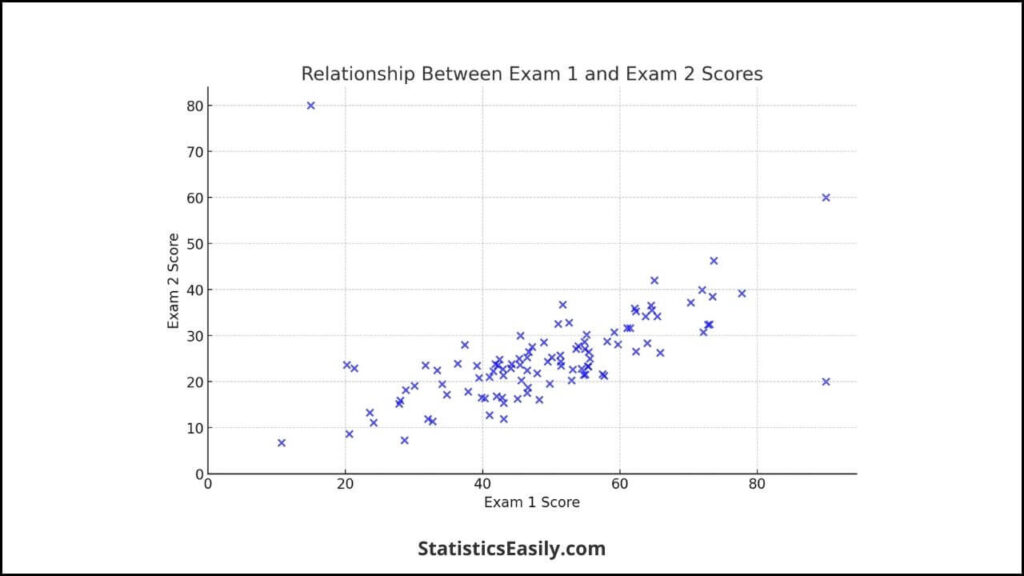
Consider the above scatterplot generated from our dataset. In it, we examine the relationship between two exam scores. Each point on the scatterplot represents a student’s performance across these exams, visually representing how these scores are related.
Scatterplots transcend mere data representation, embodying a synthesis of art and scientific methods. This duality is evident in the careful design choices that enhance the readability and interpretive value of the scatterplot, such as the selection of scale, the color differentiation of data clusters, or the addition of trend lines that guide the viewer’s understanding of the data relationships.
The artistic aspect of scatterplot design lies in its aesthetic appeal and its ability to convey complex information in an accessible and engaging manner. This is where the beauty of data visualization comes to the fore, transforming abstract numbers into a visual narrative that speaks to the viewer, revealing the underlying patterns and truths hidden within the dataset.
Simultaneously, the creation of a scatterplot is grounded in rigorous scientific principles. These principles demand a thorough understanding of the data’s nature and the relationships it holds. This scientific underpinning ensures that the scatterplot remains a reliable tool for data analysis, capable of withstanding scrutiny and providing a basis for sound conclusions.
Creating a Scatterplot: A Step-by-Step Guide
Creating informative and aesthetically pleasing scatterplots is an art that combines statistical rigor with visual storytelling. This guide will walk you through creating scatterplots using two popular tools: Python (with the matplotlib library) and R, emphasizing the craftsmanship involved in data visualization.
Download the dataset!
Creating Scatterplots in Python
Step 1: Import Libraries – First, ensure you have Python installed on your system and the necessary libraries: matplotlib and pandas. You can install these using pip if you haven’t already:
pip install matplotlib pandas
Step 2: Load Your Data – Using pandas, load your dataset from a CSV file. For this example, we’ll assume you have a dataset with two columns: ‘Exam1_Score’ and ‘Exam2_Score’.
import pandas as pd

# Load the dataset
df = pd.read_csv('path/to/your/scatterplot_dataset.csv')
Step 3: Create the Scatterplot – You can plot your data with Matplotlib. The ‘plt.scatter’ function is used for this purpose.
import matplotlib.pyplot as plt

plt.figure(figsize=(8, 6))
plt.scatter(df['Exam1_Score'], df['Exam2_Score'], alpha=0.6)
plt.title('Exam Scores Scatterplot')
plt.xlabel('Exam 1 Score')
plt.ylabel('Exam 2 Score')
plt.grid(True)
plt.show()
Creating Scatterplots in R
Step 1: Set Up Your Environment – Ensure you have R installed, and open an R script in your preferred IDE or the R console.
Step 2: Load Your Data – Read your dataset into a data frame. R’s ‘read.csv’ function is straightforward for this purpose.
df <- read.csv('path/to/your/scatterplot_dataset.csv')
Step 3: Create the Scatterplot – You can create a scatterplot using R’s base plotting system or ggplot2. Here’s how you can do it with the base plotting system:
plot(df$Exam1_Score, df$Exam2_Score, main='Exam Scores Scatterplot',
     xlab='Exam 1 Score', ylab='Exam 2 Score', pch=19, col='blue')
Best Practices for Scatterplot Design
- Choose Appropriate Scales: Ensure your axes scales reflect your data’s nature, enhancing readability and interpretiveness.
- Highlight Significant Data Points: If certain data points are critical to your narrative, consider highlighting them with different colors or markers.
- Use Aesthetic Elements Wisely: While aesthetics are important, they should serve to clarify, not obscure. Use colors and shapes that make your data more understandable.
- Incorporate Labels and Legends When Necessary: If your scatterplot includes multiple groups, use a legend to guide interpretation. Always label your axes.
- Consider Adding Trend Lines: For datasets where trends are important, adding a trend line can help emphasize the relationship between variables.
Interpreting a Scatterplot
Interpreting scatterplots involves extracting meaningful insights from the visual representation of data points, which is crucial for understanding correlations, identifying outliers, and recognizing patterns. This section will elucidate how to derive significant insights from scatterplots, using real-world examples to highlight their practical application in decision-making processes.
Understanding Correlations
Correlations between two variables are vividly illustrated in scatterplots, where the direction, form, and strength of the relationship can be visually assessed. A positive correlation is depicted when data points trend upward, indicating that as one variable increases, the other does. Conversely, a negative correlation is observed when data points trend downward, showing an inverse relationship between the variables. The absence of a discernible trend suggests a lack of correlation.
For instance, consider a scatterplot displaying the relationship between study hours and exam scores. A positive upward trend in this scatterplot would suggest that increased study hours are associated with higher exam scores, demonstrating a positive correlation.
Identifying Outliers
Outliers are data points that significantly deviate from the overall pattern of the scatterplot. They are crucial as they can indicate anomalies in the data or errors in data collection. Identifying outliers helps in further investigation, which might lead to insightful discoveries or improvements in data accuracy.
Imagine a scatterplot of daily calorie intake versus weight gain. An outlier might represent an individual with a high-calorie intake but minimal weight gain, prompting an investigation into factors like metabolism or lifestyle that might explain this deviation.
Recognizing Patterns
Besides linear trends, scatterplots can reveal more complex patterns, such as clusters of data points indicating subgroups within the data or curvilinear relationships suggesting a non-linear association between variables.
For example, a scatterplot of age versus physical activity level might show clusters, with younger individuals having higher activity levels and older individuals having lower activity levels, indicating a potential subgroup analysis within the dataset.
Practical Application in Decision-Making
Scatterplots are tools for data exploration and foundations for data-driven decision-making. By visually representing data, they allow stakeholders to grasp complex relationships quickly, aiding in strategic planning, risk assessment, and policy formulation.
Consider a healthcare scenario where a scatterplot illustrates the relationship between patient age and recovery time from a particular surgery. A clear trend indicating longer recovery times for older patients could influence pre-surgical assessments and post-operative care plans, improving patient outcomes.
Highlighting the Pursuit of Truth
Interpreting scatterplots transcends mere data analysis, embodying the pursuit of truth in data analysis. Scatterplots guide ethical decision-making grounded in empiric
Advanced Techniques and Considerations
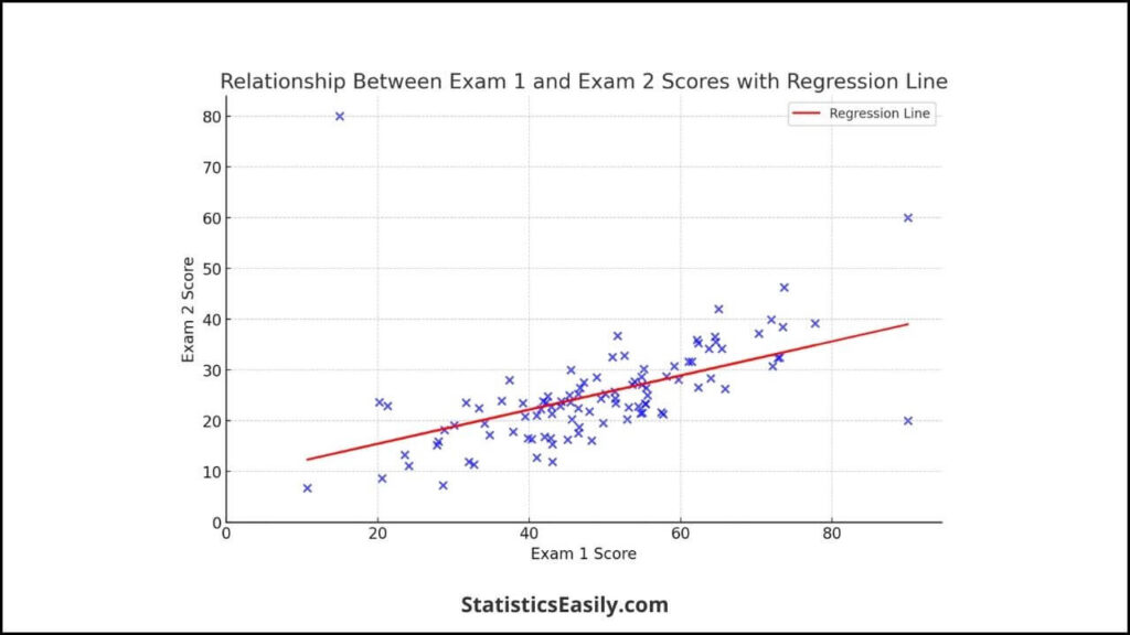
Adding Regression Lines: A regression line is a powerful tool in scatterplot analysis, clearly indicating the relationship between variables. Summarizing the data points with a single line aids in understanding the general direction and strength of the correlation. For instance, in a scatterplot showing the relationship between advertising spend and sales revenue, a regression line can help identify the effectiveness of advertising on sales.
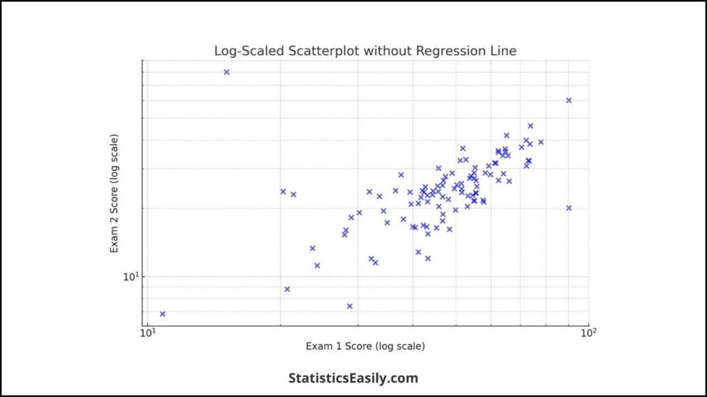
Adjusting Scales: Adjusting the scales on the axes can reveal different aspects of the data. Logarithmic scales are handy when dealing with data that spans several orders of magnitude, as they can make such scatterplots more interpretable by equalizing the spacing of scale intervals.
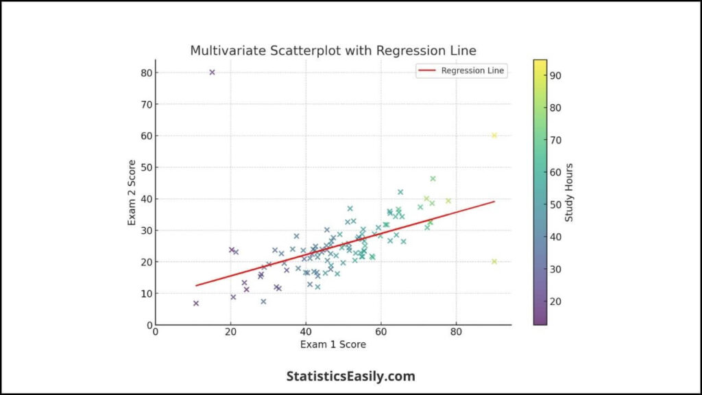
Exploring Multivariate Data: Scatterplots can be extended to multivariate data analysis by incorporating additional variables through the data points’ color, size, or shape. This technique allows for examining complex relationships involving more than two variables, providing a richer understanding of the data set.
Ethical Considerations in Data Visualization
The responsibility to present data truthfully and transparently is paramount in data visualization. Like all forms of data representation, scatterplots must be designed to accurately reflect the underlying data without misleading the viewer. This involves careful consideration of scale, color, and other design elements to avoid skewing the interpretation of the data. For example, starting an axis from a non-zero value might exaggerate trends, potentially leading to misinterpretation.
Storytelling with Data
Scatterplots serve as analytical tools and narrative devices. A well-crafted scatterplot can tell a compelling story, revealing insights that might not be immediately apparent from raw data. The art of storytelling with data involves selecting the right visual elements to highlight key findings and guide the viewer through the narrative.
Consider a scatterplot that tracks the progress of a social initiative over time. By highlighting specific data points and annotating them with critical events or milestones, the scatterplot can illustrate the initiative’s impact, turning a simple graph into a powerful narrative about change and progress.
Ad Title
Ad description. Lorem ipsum dolor sit amet, consectetur adipiscing elit.
Conclusion
As we conclude this comprehensive exploration into the world of scatterplots, we reflect on the journey through the simplicity, depth, and artistic beauty these visual tools offer. Scatterplots, with their humble beginnings as mere points on a plane, unfold intricate tales of data, revealing correlations, outliers, and patterns veiled within raw numbers.
Throughout this article, we have delved into the essence of scatterplots, understanding their fundamental role in statistics and data science. We’ve traversed through their anatomy, learning how each component, from axes to data points, plays a crucial role in storytelling. Our journey extended into the practical realm, where we equipped ourselves with the skills to create scatterplots using tools like Python and R, adhering to best practices that marry technical precision with visual appeal.
The advanced techniques section opened new avenues for deeper data analysis, introducing us to the integration of regression lines, scale adjustments, and multivariate data exploration. Here, we also touched upon the ethical backbone of data visualization, emphasizing the responsibility to present data with integrity and foster a culture of transparency and truth.
Storytelling with data, a theme interwoven throughout our discussion, highlights the power of scatterplots to represent data and narrate the underlying stories, making complex relationships understandable and engaging. This narrative power of scatterplots transforms data visualization from a mere analytical task to an art form, where data becomes a canvas and scatterplots a medium to express the hidden narratives within.
In urging readers to approach data visualization as an art requiring technical skill, we emphasize the blend of precision, creativity, and ethical responsibility. This approach enhances the clarity and insight provided by scatterplots. It elevates the discourse around data visualization to a pursuit of truth, goodness, and beauty.
Let this exploration of scatterplots inspire you to view data visualization not just as a task but as a craft, where each scatterplot created is a step towards uncovering the truth hidden within data. In this pursuit, scatterplots emerge not merely as tools but as torchbearers illuminating the path to informed decision-making and knowledge discovery, embodying the essence of what it means to bring data to life.
Recommended Articles
Read our related articles to explore more breakthrough insights in data visualization. On our blog, dive deeper into the art and science of data storytelling.
- Error Bars in Graphs: What They Tell Us About Data
- Histograms vs Bar Graphs in Data Visualization
- How To Select The Appropriate Graph?
- Create Great Graphs Easily (+Bonus)
Frequently Asked Questions (FAQs)
Q1: What is a Scatterplot? A scatterplot is a graph used in statistics to display and assess the relationship between two numerical variables visually.
Q2: How Do Scatterplots Reveal Correlations? By plotting individual data points on a two-dimensional graph, scatterplots can show how one variable is affected by another, indicating correlation patterns.
Q3: Can Scatterplots Identify Outliers? Scatterplots make outliers immediately visible, as these points lie far from the general data cluster, highlighting anomalies in the dataset.
Q4: Why Are Scatterplots Important in Data Analysis? Scatterplots provide a straightforward way to visualize complex data relationships, making identifying trends, correlations, and outliers easier.
Q5: How Do Scatterplots Aid in Decision Making? Scatterplots inform more evidence-based and insightful decisions by uncovering underlying patterns and relationships in data.
Q6: What Are Some Best Practices for Creating Effective Scatterplots? Best practices include choosing appropriate scales, clearly labeling axes, highlighting significant data points, and avoiding clutter for clarity.
Q7: How Can Scatterplots Be Enhanced for Better Interpretation? Adding trend lines, using color to differentiate data groups, and incorporating interactive elements can enhance scatterplot interpretation.
Q8: What Role Does Storytelling Play in Scatterplot Interpretation? Storytelling with scatterplots involves weaving narrative elements around the data to make the insights more relatable and compelling.
Q9: Can Scatterplots Handle Multivariate Data? Traditionally, scatterplots can be adapted for two variables to represent multivariate data through data points’ color, shape, and size.
Q10: How Do Ethical Considerations Impact Scatterplot Visualization? Ethical visualization practices ensure data is represented truthfully, avoiding misleading representations while respecting data privacy and integrity.