How to Tell Stories with Statistical Data
You will learn how to weave narrative artistry into statistical data analysis, turning numbers into stories that resonate with truth, engage audiences, and reveal the profound beauty in patterns of information.
Introduction
In the age of information, statistical data has become the cornerstone of our understanding. It informs decisions, shapes policies, and changes how we view the world. But without the ability to tell the story behind the numbers, data remains lifeless and impenetrable. This article explores how to transform complex statistics into compelling narratives grounded in truth and illuminate the beauty of well-presented information.
Highlights
- Tailoring data stories to the audience’s interests ensures the data is relatable and the insights actionable.
- The narrative arc in data storytelling guides the audience through a discovery journey, revealing insights and conclusions.
- Humanizing statistics by connecting data to real-world experiences makes complex information resonate on a personal level.
- Visuals simplify complex data, with the correct graph or chart enhancing understanding and memory retention.
- Ethical data storytelling demands truthful representation, respect for privacy, and avoiding data misrepresentation or misuse.
The Art of Data Storytelling
Data storytelling is not merely about presenting figures; it’s about weaving a narrative that engages and informs. To bring data to life, we must traverse beyond the mere presentation of facts and figures and enter the realm of narrative crafting.
Understand Your Audience
Before diving into the data, consider who your audience is and what they find meaningful. Tailor your story to their interests and level of understanding. This customization isn’t just about simplification; it’s about connection. By presenting data in a context that resonates with your audience, you make the numbers relatable and the insights they provide actionable.
Understanding your audience lies in recognizing their desires, challenges, and biases. Are they executives seeking ROI evidence? Policymakers looking for societal impacts? Or a general audience searching for knowledge? Your narrative must answer their unspoken questions and give them the truths they seek.
Find the Narrative Arc
Every dataset has a story with a beginning, middle, and end. Identify the key points: Where does the story start? What are the pivotal moments? What conclusion does it lead to?
The narrative arc serves as the backbone of your data story, guiding the audience through a journey of discovery.
The beginning sets the stage by presenting the current state or a problem. The middle unfolds the investigation, showcasing trends, patterns, and anomalies. The end reveals the insights, offering conclusions and possible solutions. This structure is not just about coherence; it’s about taking the audience on an enlightening journey that can change perceptions and incite action.
Highlight the Human Element
Statistics can feel abstract, but behind every number is a human story. Connect your data to real-world experiences that resonate on a personal level. By highlighting the human element, you transform cold, complex data into a mirror of the human experience.
The narrative gains power when the audience can see themselves or others within the data. It becomes more than a study; it reflects our society, environment, and individual roles within larger systems. These stories can elevate the mundane to the magnificent, revealing the grand tapestry of life that numbers alone cannot portray.
Translating Data into Visual Stories
Visuals are a powerful tool to make statistical data more accessible. They are essential in our quest to tell a story that not only informs but also captivates.
The Power of Visualization
Humans are visual creatures. A well-crafted chart or graph can illustrate complex data in an instantly understandable way. Visual aids serve as the illustrations in the storybook of data. They draw attention, provide clarity, and enhance memory retention.
A graph can speak to the soul in ways numbers cannot, revealing the drama behind the data – the triumph of increasing trends or the tragedy of declining figures. By employing visuals, we give the audience a lens through which they can view the beauty inherent in the data’s structure and insights.
Choose the Right Visualization
Match your visualization to your narrative. Use bar graphs for comparisons, line charts to show change over time, and heat maps to display density or intensity. The choice of visualization is critical in how effectively your story is told.
A mismatched graph or a poorly designed infographic can confuse and mislead. But the proper visualization is a powerful rhetorical device, persuading the audience of your story’s validity. This choice must not be taken lightly, for it is the stage upon which your narrative will unfold.
Keep It Simple
A good visualization conveys the message at a glance. Avoid clutter and focus on the most critical data points. The principle of simplicity is paramount. It’s about stripping away the superfluous to reveal the essence of the data.
This simplicity should not be confused with triviality. On the contrary, a simple visualization can reveal the profound truths hidden within the data, much like a well-written novel can reveal the complexities of human nature with a few well-chosen words.
Crafting the Narrative with Descriptive Statistics
Descriptive statistics summarize your data and are a great starting point for any narrative. They are the brushstrokes that paint the initial picture of the data landscape.
Summarize Your Data
Use measures of central tendency and variability to give your audience a quick snapshot of your data. A mean or median can speak volumes about the state of affairs, and a standard deviation can tell a tale of consistency or disparity. These summaries are the foundation of any good story, setting the stage for deeper analysis and understanding.
It’s through the effective use of descriptive statistics that we can provide a concise and accurate portrayal of the data. They offer the audience a foothold, a place to start understanding before delving into the complexities of the whole narrative.
Use Comparative Metrics Wisely
Comparisons can be robust, but they must be fair and relevant. Always put them in context to avoid misleading your audience. The art of comparison is the art of contrast – it highlights differences and similarities, allowing the audience to conclude the significance of the data.
When used judiciously, comparative metrics can unveil truths that may not be immediately evident. They offer a scale against which we can measure the impact and importance of our data, providing a benchmark for understanding.
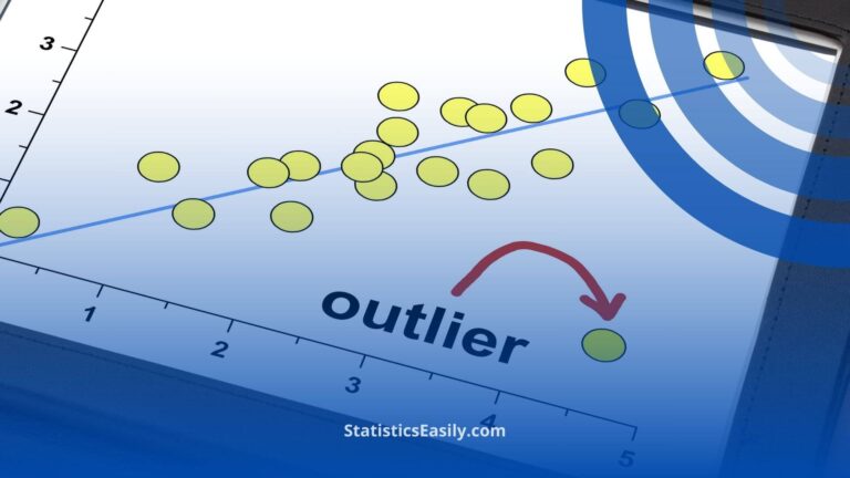
Tell the Story Behind the Outliers
Outliers can be anomalies, or they can reveal more profound truths. Explore these and explain their significance in the narrative. These data points often hold the most intriguing stories, illuminating the unexpected.
Outliers can prompt us to ask new questions: Why does this data point differ? What story is it trying to tell? By exploring outliers, we can uncover the narratives that lie on the fringes of our data, often leading to groundbreaking insights and discoveries.
The Role of Inferential Statistics in Storytelling
Where descriptive statistics help us to understand the past, inferential statistics empower us to predict the future. These tools allow us to extend our narrative beyond the current data to make educated guesses about what is yet to come. By using probability models, hypothesis testing, and regression analysis, we can provide a glimpse into the future, tell stories of potential outcomes, and help decision-makers navigate the uncertainty that lies ahead.
Predictive Power of Models
Statistical models can be used to forecast outcomes and trends. This predictive power turns data into a crystal ball, offering visions of the future that, while not certain, are grounded in empirical evidence. A carefully constructed model can predict market trends, health outcomes, or environmental changes, giving us the power to prepare for what’s coming.
Incorporating predictive analytics into your data story adds a dynamic element. It transforms the narrative from a static tale to an ongoing saga. This forward-looking perspective can inspire action and innovation, as it provides stakeholders with a vision of what could be, supported by the credibility of quantitative analysis.
Hypothesis Testing in Narratives
Hypothesis testing is a dramatic element in the story of data. It’s the tension of the ‘what-if’ – the possibility of proving a theory right or wrong. Presenting a hypothesis and the subsequent testing process is akin to a mystery where the data is vital to unlocking the truth.
This methodology provides a framework for introducing conflict and resolution into your narrative. Will the data support the hypothesis, or will it be refuted? This natural suspense engages the audience as they anticipate the conclusion that the data will reveal.
Regression Analysis as Story Progression
Regression analysis shows how variables are interconnected. It allows you to take your audience through the web of causality and correlation, highlighting the intricate relationships within the data.
By illustrating these relationships, you give depth to your narrative. It’s about more than what the data shows and why it delivers what it does. Regression analysis can help to identify the underlying forces at play, offering a more comprehensive understanding of the complexities involved.
Ethical Considerations in Data Storytelling
Ethics must be a cornerstone of any data narrative. The responsible use of data is not only about accuracy but also about integrity. Misrepresentation or misuse of data can lead to harmful outcomes. As storytellers, we must be vigilant guardians of the truth.
Responsibility to Represent Data Honestly
Your narrative must represent the data truthfully, without bias or distortion. The temptation to cherry-pick data that supports a preferred narrative must be resisted. Each data point has its integrity and deserves to be presented in context.
A truthful representation ensures that the story you’re telling is not just compelling but also righteous. It respects the audience’s right to be informed and make decisions based on accurate information. This adherence to honesty is a commitment to upholding the principles of goodness in data analysis.
Privacy and Data Sensitivity
In an era where data breaches are common, respecting the privacy of individuals whose data we are analyzing is paramount. Anonymization and careful handling of sensitive information are not just legal requirements but moral imperatives.
When telling stories that involve personal data, it is essential to ensure that the dignity and privacy of individuals are maintained. This is part of the beautiful aspect of data storytelling – the ability to share powerful insights without compromising the confidentiality of the subjects involved.
Data Visualization Ethics
The aesthetics of your visuals are essential, but they must not override accuracy. Ethical visualization respects the data’s proportions and relationships and avoids misleading representations.
Choose visualizations that enlighten rather than confuse. The use of color, scale, and design should enhance the narrative, drawing attention to the critical elements without altering the underlying truths of the data. This approach is at the heart of creating beautiful visual stories that are both informative and truthful.
Example of Practical Application
Turning Health Data into a Catalyst for Change!
The Challenge of Cholesterol: A Community’s Journey to Heart Health
Introduction:
In a small town, local doctors were alarmed by the increasing rates of high cholesterol levels among the population—a risk factor for heart disease. To address this, the community health department partnered with a team of statisticians to understand and combat the issue through data storytelling.
Understanding the Audience:
The primary audience was the local population at risk, including middle-aged adults and seniors. The secondary audience included healthcare providers and policymakers who could drive change. Both groups needed to understand the seriousness of the issue and the actionable steps they could take.
Data Collection:
Healthcare data from the past five years was collected, including cholesterol levels, dietary habits, exercise frequency, and other lifestyle factors. The aim was to find patterns to tell a story about the community’s heart health.
The Narrative Arc:
Beginning: The story started by presenting the troubling trend: a 15% increase in high cholesterol cases over five years.
Middle: Descriptive statistics painted a clear picture—median cholesterol levels were above the national average, and a heat map of the town highlighted neighborhoods with the highest prevalence.
End: The data story revealed that areas with poor access to healthy food and recreational facilities had the worst health metrics.
Humanizing the Data:
To humanize the statistics, the narrative included personal stories. One was about a resident, a 58-year-old man who suffered a mild stroke due to high cholesterol. His experience put a face to the numbers, making the data resonate on a personal level.
Visualizing the Data:
A series of visuals were used to tell the story:
1. A line graph shows the rising trend of cholesterol levels over time.
2. A bar chart compares the town’s data with national averages.
3. A heat map identified ‘hotspots’ for high cholesterol levels.
Descriptive Statistics in Action:
The mean and median cholesterol levels were spotlighted, providing a snapshot of the community’s health. The high variance signified a wide disparity in health across different areas, warranting further investigation.
Uncovering Stories Behind the Outliers:
An outlier analysis identified individuals with healthy cholesterol levels despite living in high-risk areas. Their habits were examined, offering clues to potential community-wide interventions.
Predictive Analytics for Future Health:
Inferential statistics were applied to develop predictive models, forecasting the potential impact of community interventions. Hypothesis testing challenged assumptions about local health, leading to robust, data-driven conclusions.
Ethical Narrative and Empowerment:
The story was crafted with a commitment to honesty and respect for privacy. All personal data was anonymized, ensuring individual stories highlighted the collective journey without breaching confidentiality.
Conclusion and Call to Action:
The data story concluded with clear, actionable insights. It called for community-wide efforts to improve access to healthy food and facilities. The audience was empowered with knowledge and motivated to engage in lifestyle changes and support policy initiatives for better health infrastructure.
This example not only provided a clear understanding of the issue and its underlying factors but also mobilized the community towards positive change, showcasing the transformative power of well-crafted data stories.
Closing the Narrative
Concluding your data story is as important as beginning it. The end of your narrative should leave your audience with clarity and a call to action. What can they do with the information you have provided? How can they apply it to their lives or work? A reasonable conclusion not only summarizes the insights gained but also points to the next steps.
The closing of your story is your final opportunity to reinforce the good, the true, and the beautiful. It’s a chance to reflect on the journey you’ve taken your audience on, consolidate the insights gained, and inspire hope and action. By concluding your narrative on a note of empowerment, you affirm the value of the data and the story it has told.
In crafting data narratives that adhere to these principles, we not only serve the cause of knowledge but also contribute to a culture of integrity and beauty in data science.
Recommended Articles
Unlock more insights — dive into related reads on our blog to continue your journey through the power of data storytelling.
- Join the Data Revolution: A Guide to Statistical Learning
- How Statistics Can Change Your Life: A Guide for Beginners
- How To Select The Appropriate Graph?
Frequently Asked Questions
Q1: What is the importance of storytelling in statistics? Storytelling in statistics is crucial for transforming complex data into engaging, comprehensible narratives that resonate with audiences. It turns numbers into impactful stories that reveal patterns and truths, making the information more relatable and actionable.
Q2: How does understanding the audience improve data storytelling? Understanding the audience’s interests, challenges, and biases allows for tailored data stories that connect personally, making the insights the data provides relatable and actionable.
Q3: What is a narrative arc in data storytelling? A narrative arc is a structured approach to storytelling that guides the audience through a journey of discovery, starting with a problem or current state, moving through analysis, and ending with conclusions or solutions.
Q4: Why is the human element significant in data storytelling? The human element bridges the gap between abstract statistics and personal experience, making complex information resonate more deeply by reflecting the human experience and society.
Q5: How do visuals aid in data storytelling? Visuals simplify complex data, provide clarity, enhance memory retention, and serve as powerful tools to convey a narrative, allowing the audience to grasp the underlying stories within the data instantly.
Q6: What is the role of descriptive statistics in storytelling? Descriptive statistics summarize data, providing a foundational snapshot that sets the stage for deeper analysis and narrative, allowing the audience to grasp the story’s context quickly.
Q7: Why is it essential to address outliers in data stories? Outliers can indicate anomalies or uncover deeper truths and patterns, prompting further investigation and enriching the story by revealing unexpected insights.
Q8: How do inferential statistics contribute to storytelling? Inferential statistics extend narratives beyond current data, using models and tests to predict future trends and outcomes, adding a forward-looking element to the story.
Q9: Why are ethical considerations crucial in data storytelling? Ethical considerations ensure the truthful, respectful, and responsible representation of data, upholding the story’s integrity and protecting the privacy and dignity of individuals represented in the data.
Q10: How should a data story be concluded? A data story should conclude by summarizing insights, reinforcing the core messages, and providing a clear call to action or next steps, empowering the audience to apply the story’s lessons.