How To Select The Appropriate Graph?

To select the appropriate graph, identify the variables you want to represent and determine their types (quantitative or qualitative). Then, choose the graph type based on the combination of variables and the desired representation.
Struggling to determine the most suitable graph to represent your data? You’ve come to the right place! Creating accurate and effective graphs is increasingly essential across various fields. One challenge often encountered is organizing and classifying data correctly. After reading this article, you’ll know how to select the best graph type to represent your data.
A well-crafted graph should simplify the understanding of the data being presented.
The importance of this skill for professional success, particularly in academics, is undeniable.
Numerous graph types exist, including scatter plots, bar charts, pie charts, and line graphs. The question is, when and how should each be used?
Organizing and classifying the data you wish to represent graphically makes it easy to determine the most suitable graph type.
We’ll introduce a simple method to help you choose the best graph for your data.
First, identify the variables you want to represent on the graph.
Next, determine the types of variables.
Broadly speaking, variables can be either quantitative or qualitative.
Quantitative variables represent numerical values — measurable or countable, such as age, weight, height, number of children, concentration, or percentage.
Conversely, qualitative variables represent categories — observable and classifiable but not countable or measurable, such as gender, species, eye color, marital status, or social class.
After identifying the variables’ types, selecting the appropriate graph becomes straightforward.
Most graphs are two-dimensional, with X and Y axes:
Each axis should represent one variable.
Refer to the following guide to choose the appropriate graph based on the variable types for each axis:
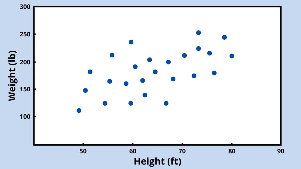
Quantitative Variable x Quantitative Variable
Examples: weight x height, age x BMI, altitude x temperature, precipitation x humidity.
Use a scatter plot to represent two quantitative variables graphically.
For example, suppose you want to plot the relationship between weight and height in an indigenous community.
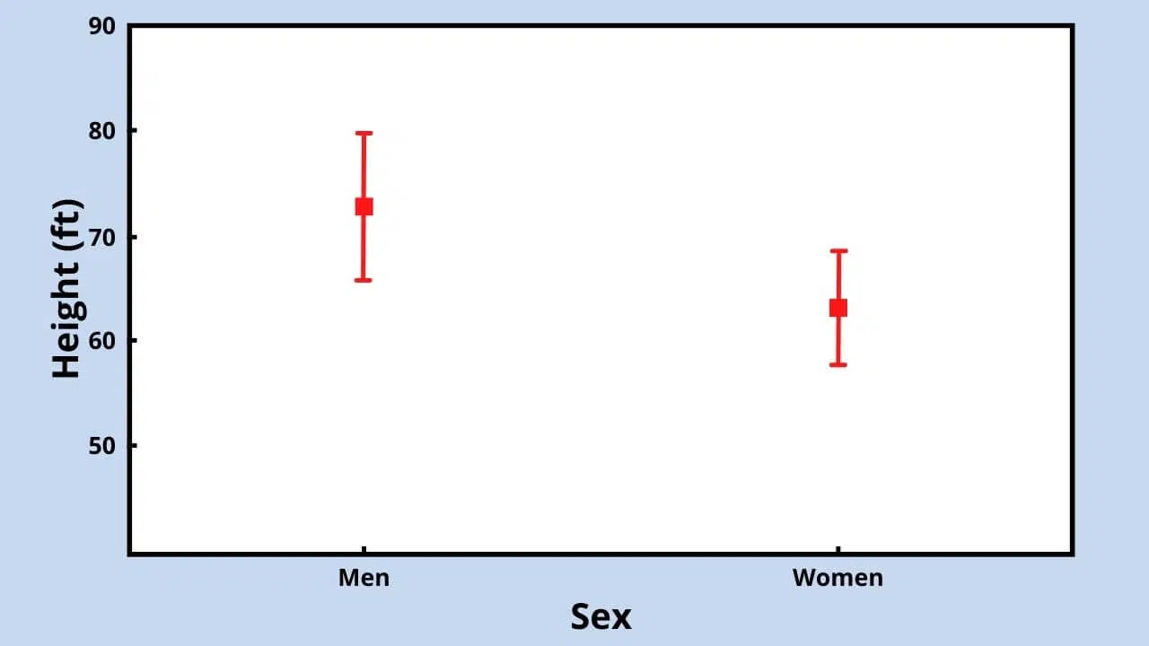
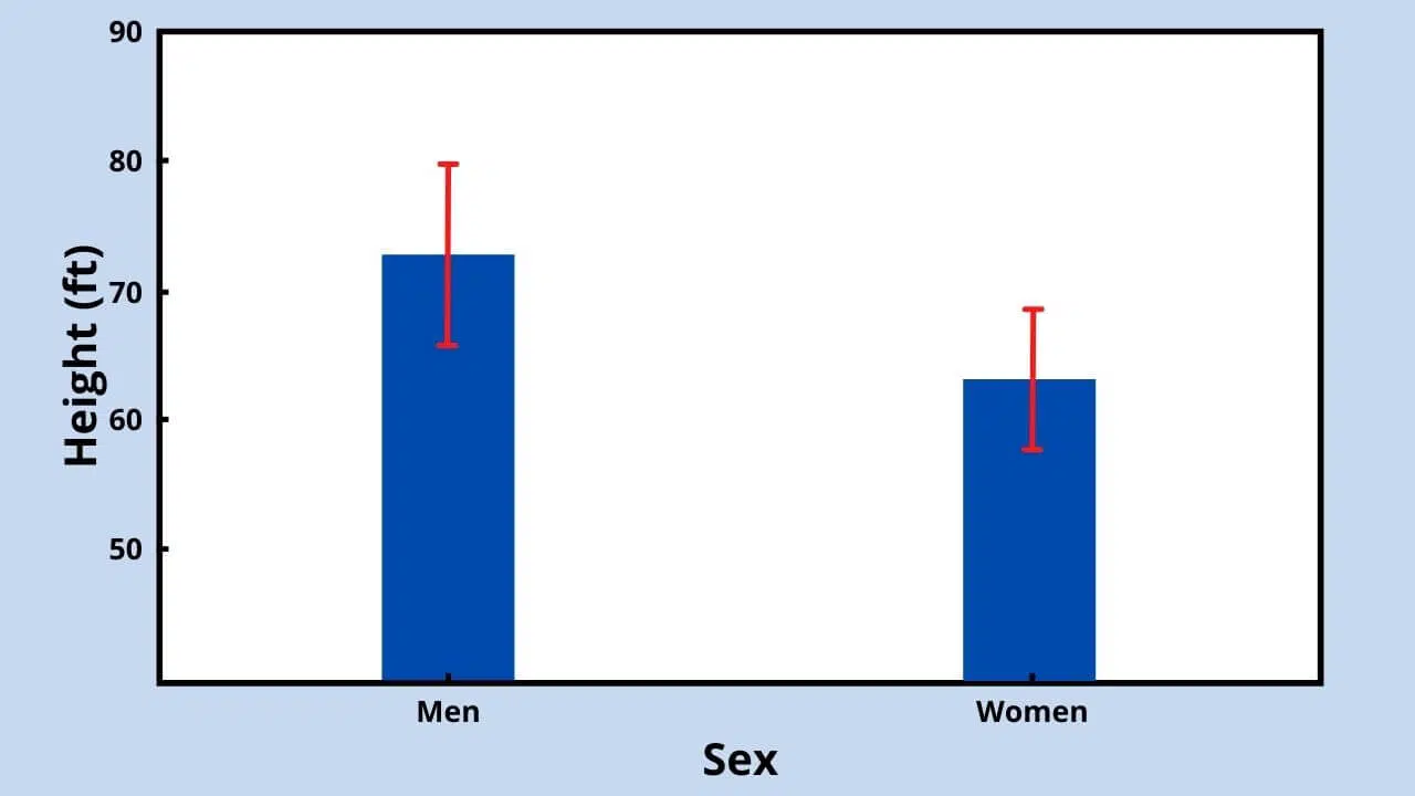
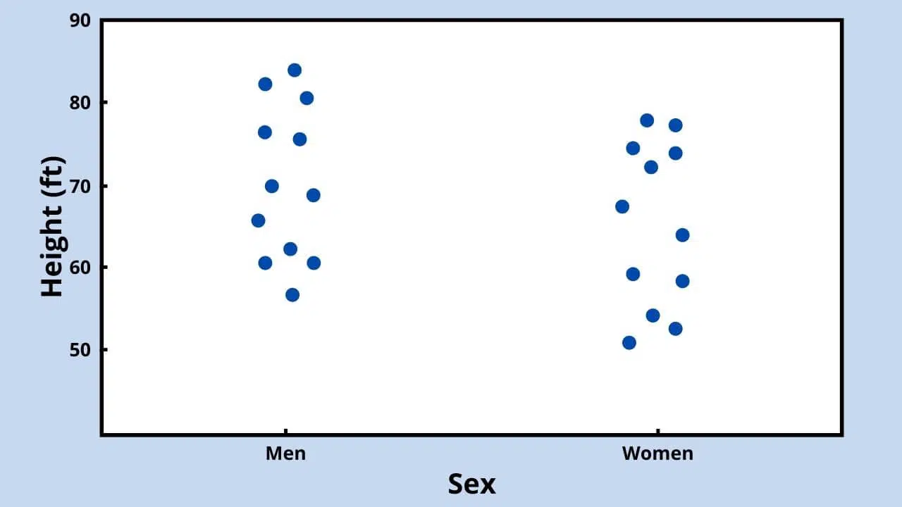
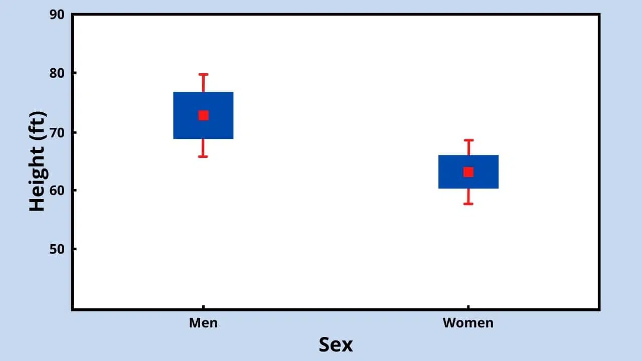
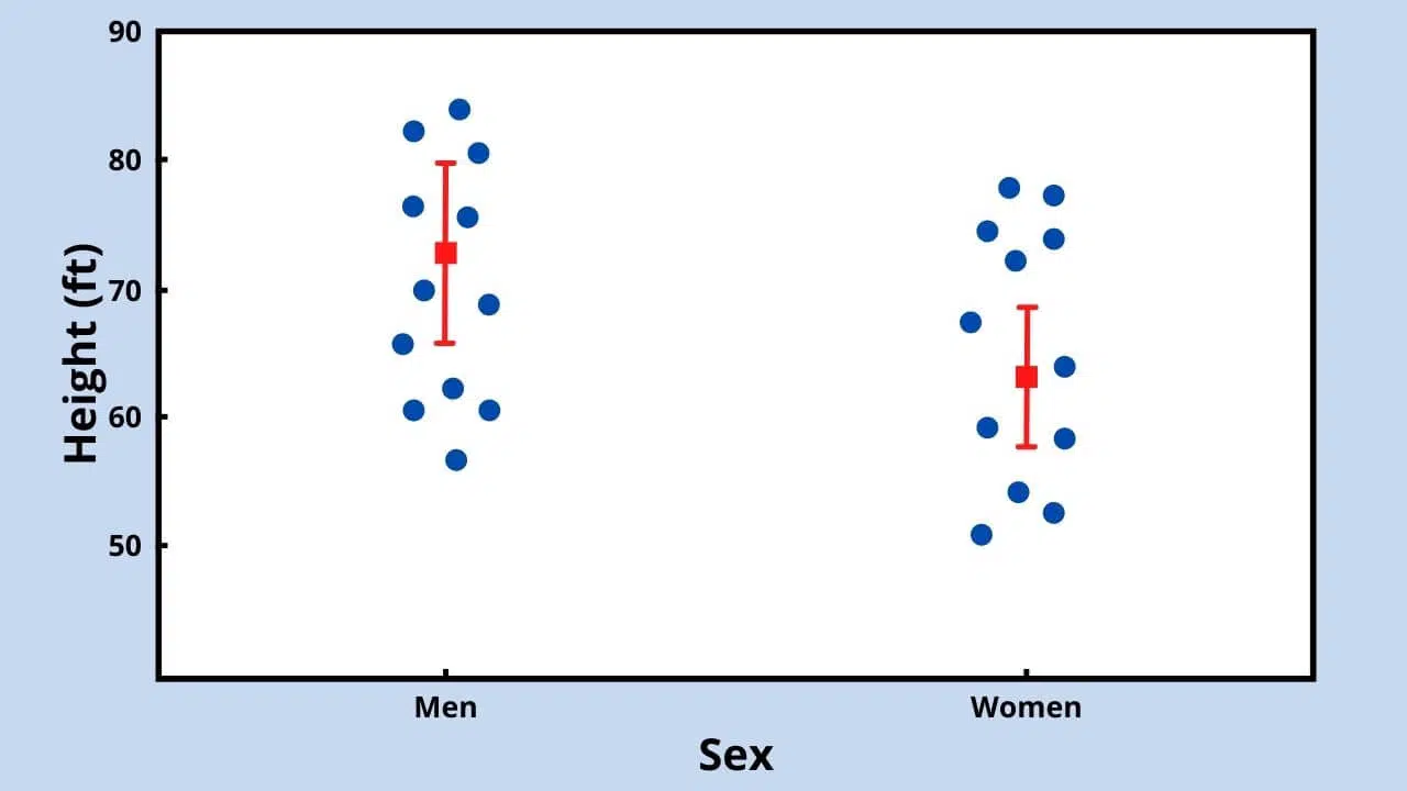
Qualitative Variable x Quantitative Variable
Examples: sex x height, species x length, marital status x weight, type of medicine x cure percentage.
To graph a qualitative and quantitative variable, use one of the following graph types:
(a) Mean with error bars plot
(b) Dot plot
(c) Box plot
For example, suppose you want to graph the comparison between men’s and women’s heights in a particular company.
The five graphs above present the same data differently, representing mean, standard deviation, and raw data.
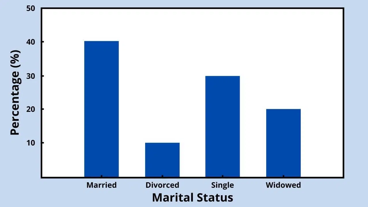
One Qualitative Variable (frequency)
Examples: marital status, religion, biome, country, sex, eye color, smoker/non-smoker, healthy/unhealthy, education, month.
To represent the frequency (quantity or percentage) of each qualitative variable category, use:
(a) Sector graph, also known as a pie chart
(b) Bar plot, also known as a column plot
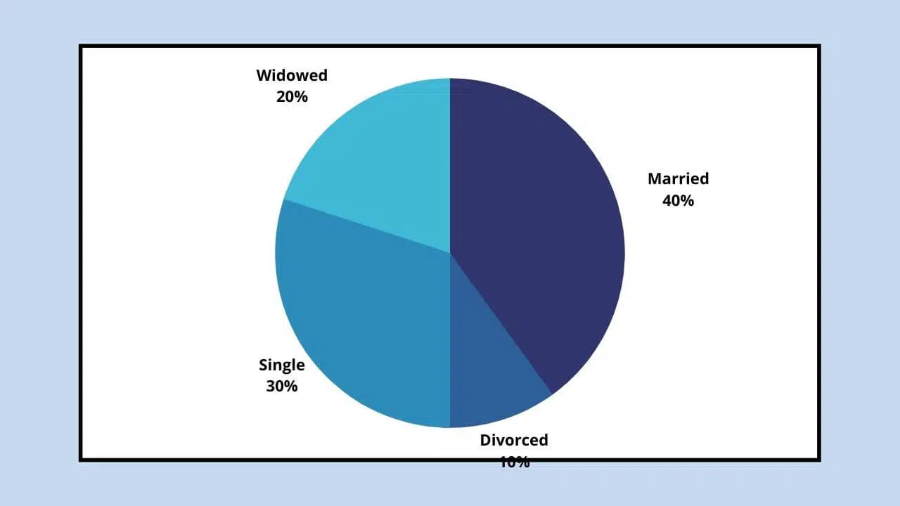
For example, given the qualitative variable marital status with categories married, single, widowed, and divorced, create a bar plot showing the frequency of each category in the sample.
Represent the number or percentage of people in each category using a pie chart or bar plot.
One Quantitative ariable (Frequency)
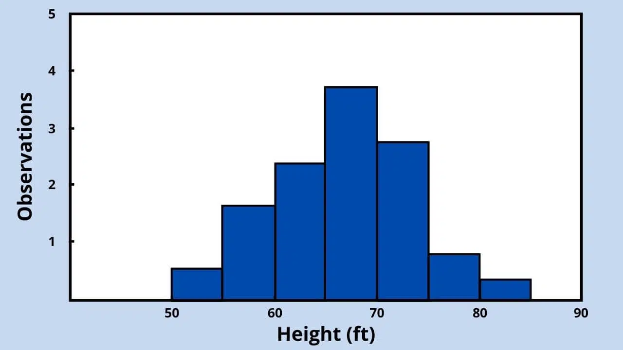
Histograms, like pie charts, represent variable frequencies; however, histograms display quantitative variables.
Divide the quantitative variable into classes or categories before graphing.
For example, to graph the height of a university population, use a histogram. Divide the quantitative variable (height) into classes for representation.
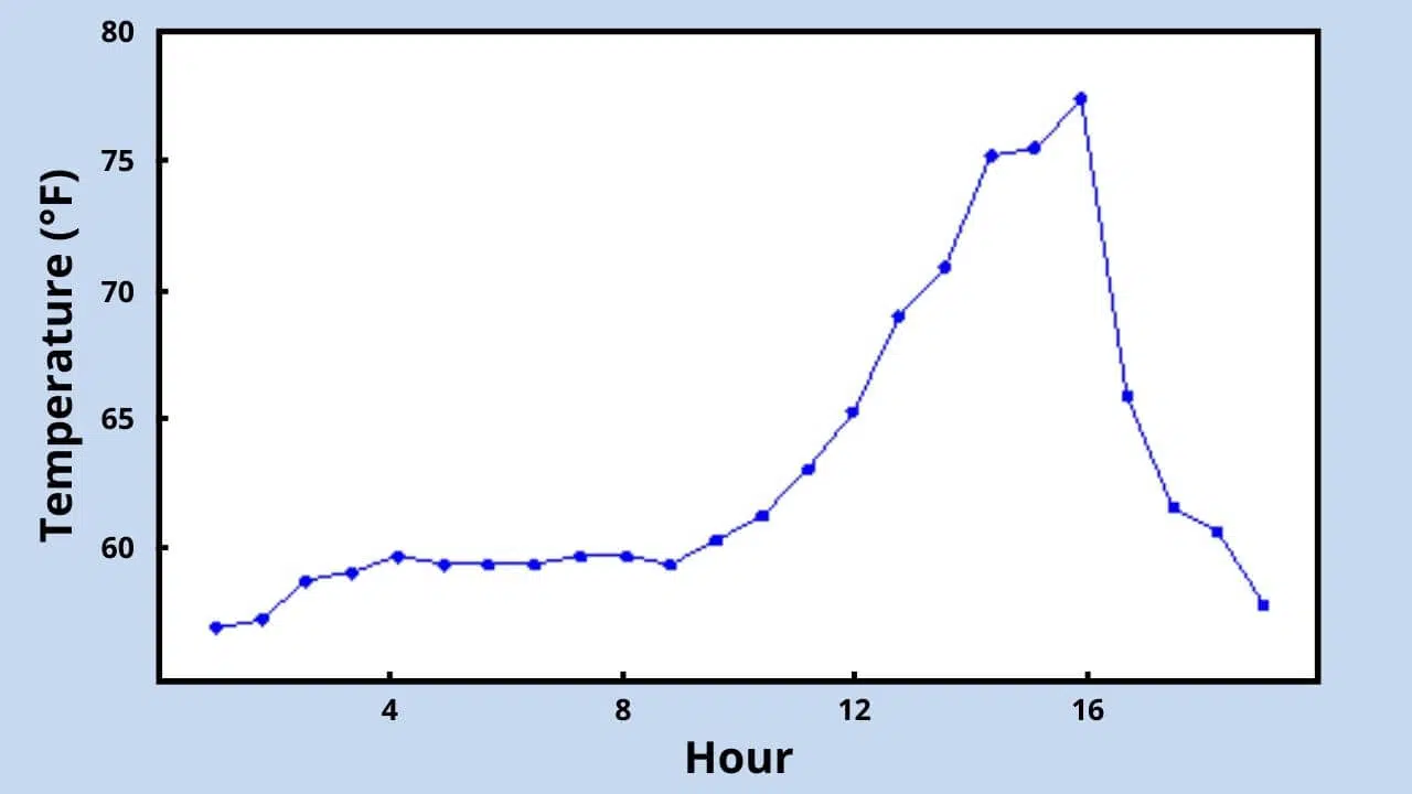
Line Plots (Ordinal Variable x Quantitative Variable)
Examples: temperature x months of a year, stock value x last 30 days, species richness x distance from the river.
The line plot displays a series of points connected by a line.
This type of graph is typically used to examine changes or trends in a quantitative variable over time.
Besides time, line plots can also show spatial trends (distance) or any series with a specific order.
For example, suppose you want to graph the average temperature per hour for one day.
The graphs discussed here are the most commonly used and can effectively represent various types of data:
1. Scatter plot
2. Mean with error bars plot, dot plot, or box plot
3. Bar/column chart or pie chart
4. Histogram
5. Line plot
To determine which graph to use, first, select the variable(s) you want to display. Next, define each variable’s type (quantitative or qualitative). Finally, choose the graph based on the combination of variables and what you want to represent, as outlined above.
Take advantage of our other exceptional articles about graphs! Enhance your knowledge and improve your graph selection skills by exploring our recommended resources. Click here to dive deeper into the world of data visualization and unlock your full potential!

Master “How do you calculate degrees of freedom” in statistical analysis to enhance data accuracy and insights.

Delve into the world of data analysis with our comprehensive guide on random sampling. Learn its importance, types, challenges, and common misconceptions.

Dive into the crucial difference between correlation vs causality in data analysis, and learn how to avoid common pitfalls and misconceptions.

Discover the best normality test for data analysis based on Razali and Wah’s study comparing 4 popular tests. Read now!

Learn how to find Cohen’s d, a crucial statistical measure quantifying the standard difference between two means in data analysis.

Master Data Cleaning Techniques with our guide: uncover strategies for pristine data, enhancing accuracy and insights in your analysis.