How to Create Regression Lines in Excel
Learn how to create and interpret regression lines in Excel using scatter plots, trendlines, and the Data Analysis ToolPak for powerful data analysis.
Highlights
- Step-by-step instructions for creating regression lines
- Comprehensive overview of scatter plots and trendlines
- Introduction to the Data Analysis ToolPak
- Tips for interpreting and customizing regression lines
- Advanced techniques and shortcuts for data analysis
Data analysis is a crucial skill in today’s data-driven world, and Microsoft Excel is a powerful tool for this purpose.
One essential technique is creating regression lines, which can help you understand relationships between variables and make predictions.
In this guide, we will teach you how to create regression lines in Excel using scatter plots, trendlines, and the Data Analysis ToolPak.
By following our step-by-step instructions and expert tips, you’ll be able to harness the full potential of regression lines in your data analysis projects.
Frequently Asked Questions
Before diving into creating regression lines in Excel, it’s crucial to understand the most basic concepts of linear regression
What is linear regression?
Linear regression is a statistical method that models the relationship between a dependent variable and one or more independent variables by fitting a straight line to the data.
When to use linear regression?
Use linear regression when you want to predict a continuous dependent variable based on one or more independent variables and when the relationship between the variables is linear.
Example of linear regression
Predicting house prices (dependent variable) based on square footage (independent variable). As square footage increases, house prices usually increase linearly.
Is it easy to do a linear regression?
Yes, it’s relatively easy to perform a linear regression, especially with software tools like Excel, which provide built-in functions to do the analysis.
Can I do linear regression in Excel?
Yes, you can perform linear regression in Excel using methods like scatter plot with a trendline or the Data Analysis ToolPak.
What is the best way to create regression lines in Excel?
The best method depends on your needs. For a simple visualization, use a scatter plot with a trendline. For more in-depth statistical information, use the Data Analysis ToolPak.

🌟 TRANSFORM YOUR DATA SKILLS OVERNIGHT
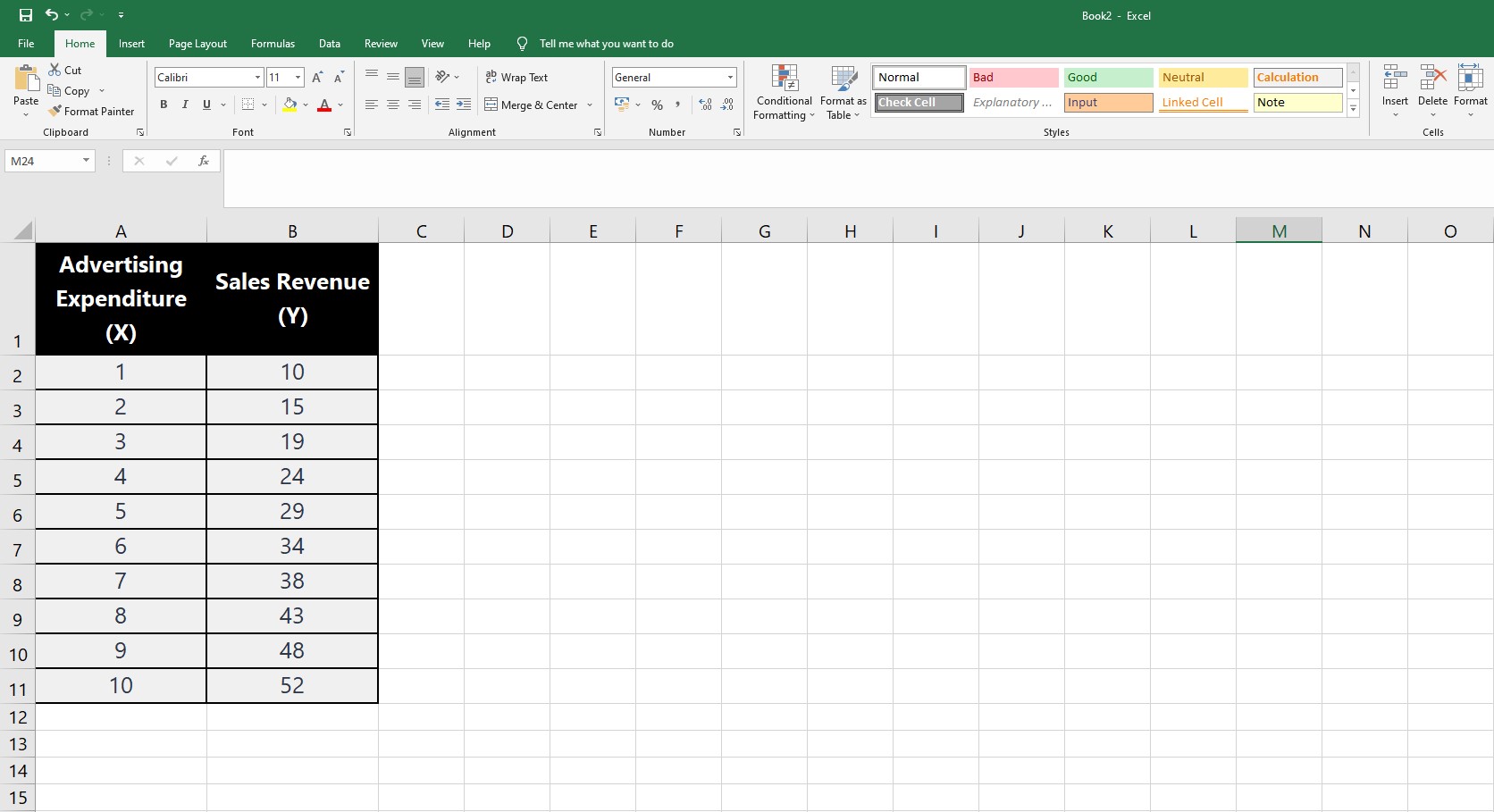
Example Data for Regression Analysis
The table below provides a sample dataset for you to practice creating regression lines in Excel. To copy the data, just click on the “Copy Data to Clipboard” link, and the data will be ready for you to paste directly into your Excel worksheet. Follow the steps outlined in the article to perform linear regression analysis on this example data.
| Advertising Expenditure (X) | Sales Revenue (Y) |
|---|---|
| 1 | 10 |
| 2 | 15 |
| 3 | 19 |
| 4 | 24 |
| 5 | 29 |
| 6 | 34 |
| 7 | 38 |
| 8 | 43 |
| 9 | 48 |
| 10 | 52 |
Regression Lines in Excel:
Scatter Plots & Trendlines
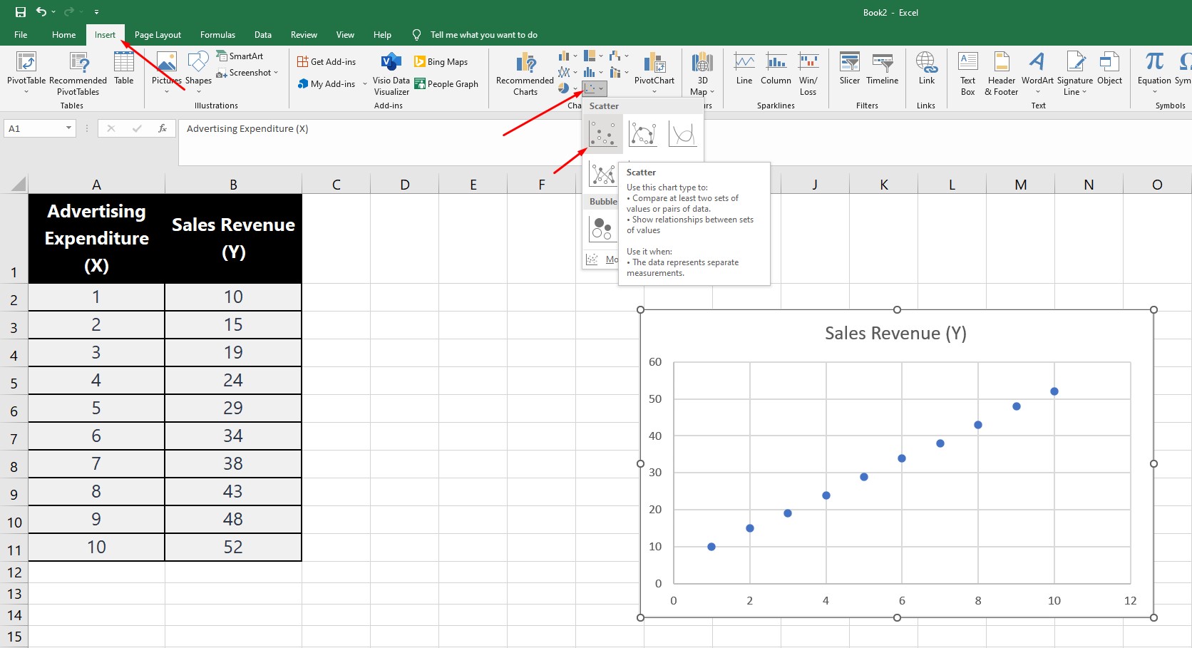
To create regression lines in Excel, you can use the built-in scatter plot chart with a trendline. Follow these step-by-step instructions:
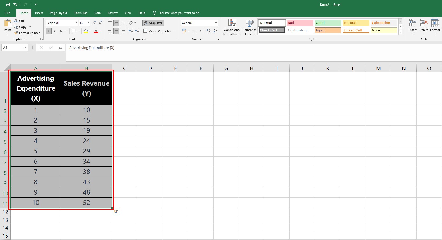
1. Prepare your data: Organize your data in two columns, with one column for the independent variable (x-axis) and another column for the dependent variable (y-axis).
2. Select the data: Click and drag to select the range of data you want to use for the scatter plot, including both the independent and dependent variable columns.
3. Insert a scatter plot chart: Go to the “Insert” tab in the Excel toolbar, click the “Insert Scatter (X, Y) or Bubble Chart” icon, and select “Scatter with Straight Lines” or “Scatter” (if you prefer to add the trendline later).
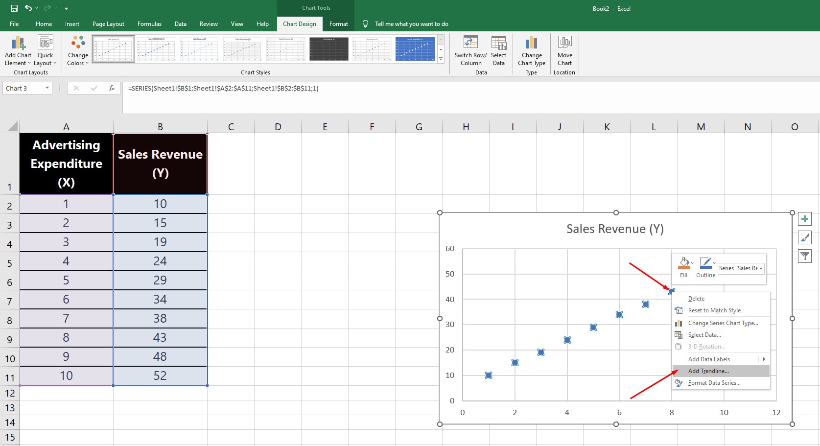
4. Add a trendline: If you’ve selected “Scatter” in step 3, you’ll need to add a trendline manually. Click on any data point within the scatter plot, right-click, and choose “Add Trendline” from the context menu. By default, Excel will add a linear trendline.
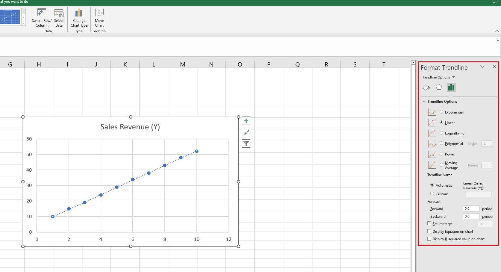
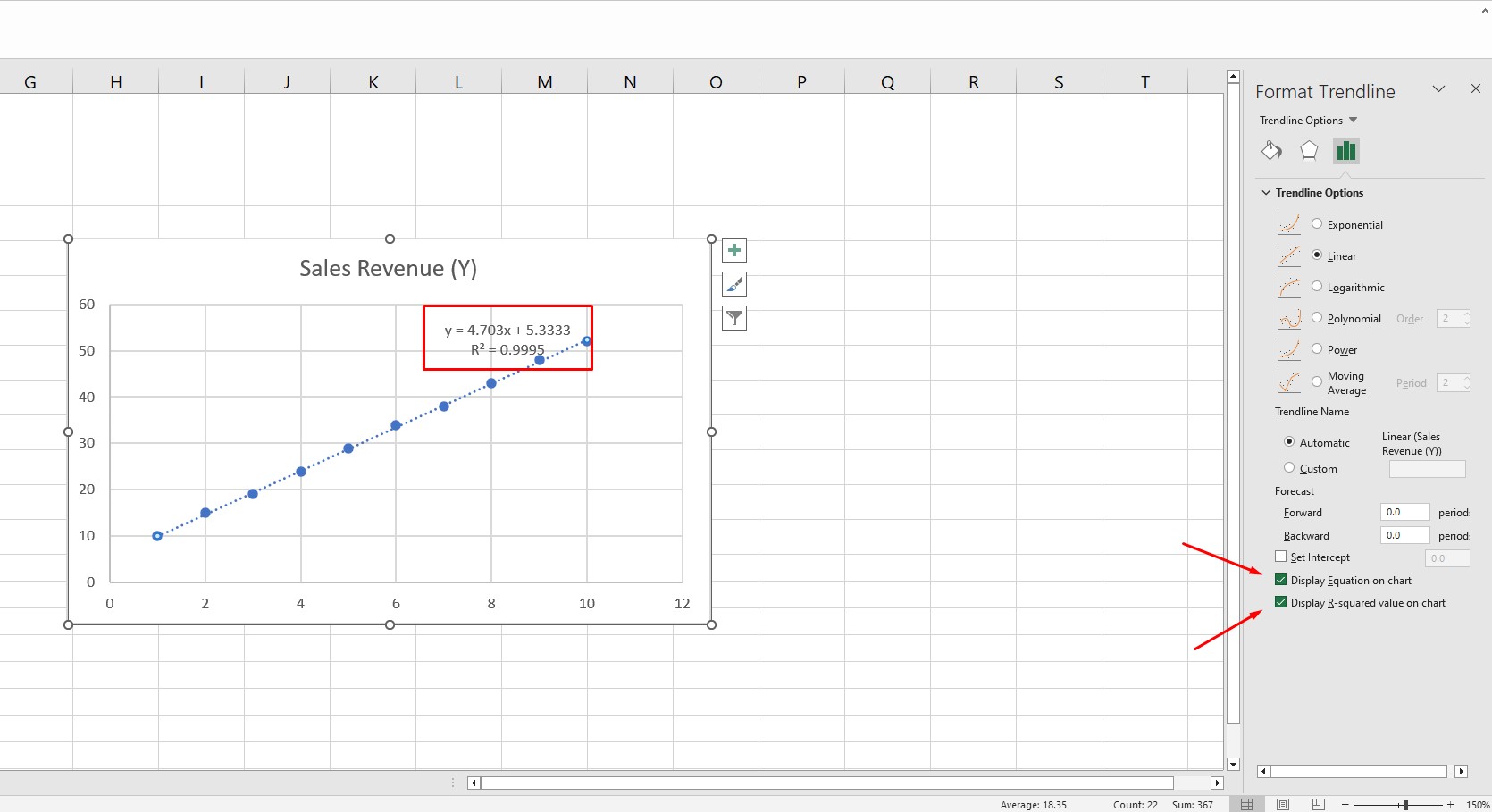
5. Customize the trendline: To change the type of trendline, such as a polynomial, exponential, or logarithmic, double-click the trendline or right-click and choose “Format Trendline” from the context menu. In the “Format Trendline” pane, you can select the desired regression type, adjust the line’s color and style, and display the equation and R-squared value on the chart.
6. Interpret the results: The trendline (regression line) represents the relationship between the independent and dependent variables. The equation (e.g., y = mx + b for linear regression) and R-squared value can help you understand the strength and direction of this relationship.
Regression Lines in Excel:
Data Analysis ToolPak
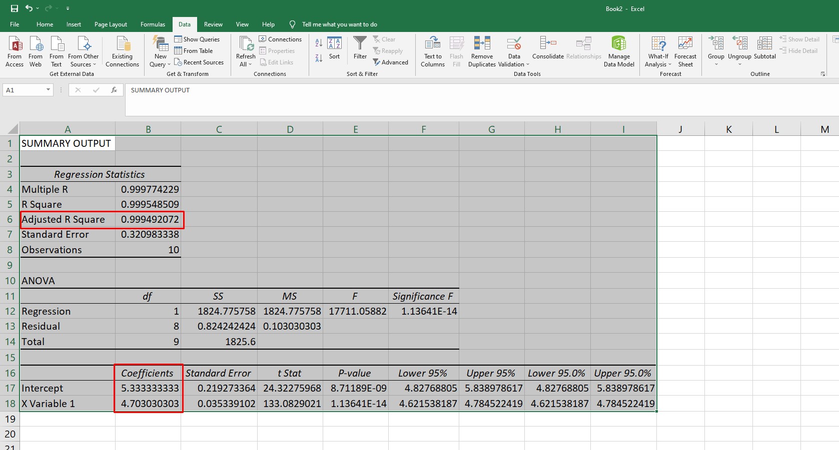
Yes, there is another way to create a regression line in Excel using the built-in Data Analysis ToolPak. This method provides more statistical information than just using a scatter plot chart with a trendline. Here’s how to do it:
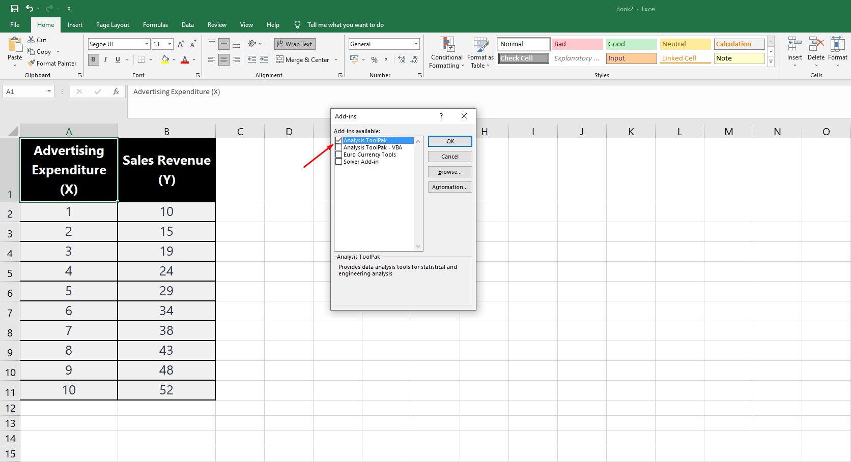
1. Enable the Data Analysis ToolPak: Go to the “File” tab, click “Options,” and then choose “Add-Ins” from the left-hand menu. At the bottom, in the “Manage” dropdown, select “Excel Add-ins” and click “Go.” Check the box next to “Analysis ToolPak” and click “OK” to enable it.
2. Prepare your data: Organize your data in two columns, with one column for the independent variable (x-axis) and another column for the dependent variable (y-axis).
3. Open the Data Analysis ToolPak: Go to the “Data” tab in the Excel toolbar and click the “Data Analysis” button on the far right.
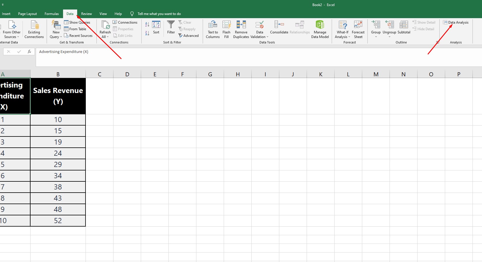
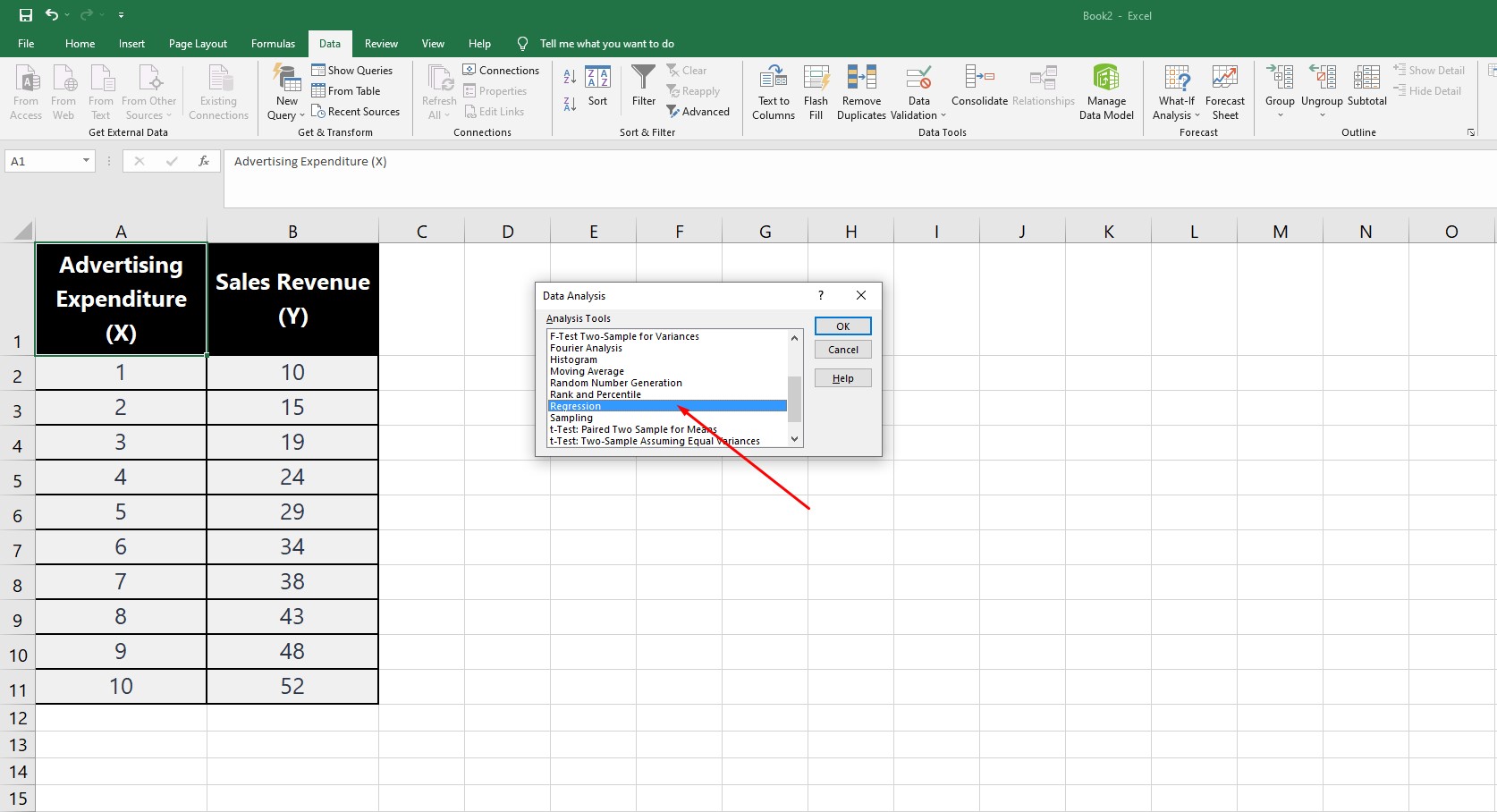
4. Select “Regression”: In the Data Analysis window, choose “Regression” from the list of available analyses and click “OK.”
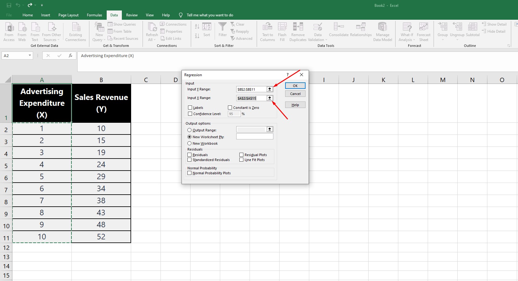
5. Specify the input data: In the “Regression” window, you’ll need to define the input data for the analysis. For the “Input Y Range,” select the column containing the dependent variable data. For the “Input X Range,” select the column containing the independent variable data.
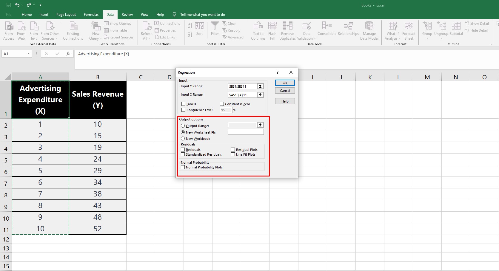
6. Choose output options: Under “Output options,” you can choose where the regression results will be displayed. You can create a new worksheet or display the results in the same worksheet by selecting a specific cell as the top-left corner.
7. Run the analysis: Click “OK” to run the regression analysis. Excel will generate a table with various statistical information, including the regression equation (in the form of the intercept and coefficients) and the R-squared value.
To create a regression line with this method, use the resulting regression equation and apply it to your independent variable data. You can then create a scatter plot chart as described in the previous answer, and add the calculated regression line values as a new data series.
This alternative method provides more in-depth statistical information and allows for greater customization of your regression analysis in Excel.
| Method | Scatter Plot with Trendline | Data Analysis ToolPak |
|---|---|---|
|
Ease of Use |
Easy |
Moderate |
|
Visualization |
Yes |
No |
|
Basic Regression Equation |
Yes |
Yes |
|
R-squared Value |
Yes |
Yes |
|
In-depth Statistical Analysis |
No |
Yes |
|
Multiple Independent Variables |
No |
Yes |
|
Customizable Regression Types |
Limited |
More options |
Key Considerations for Effective Regression Analysis
In addition to creating regression lines in Excel, it’s essential to be aware of some key considerations that impact the accuracy and reliability of your analysis.
By understanding the underlying assumptions, evaluating residuals, conducting significance testing, and comparing models, you’ll ensure that your regression analysis is both valid and informative.
This brief overview highlights the importance of these considerations in the context of linear regression in Excel.
Conclusion
We hope this guide has helped you understand how to create and interpret regression lines in Excel effectively.
By mastering scatter plots, trendlines, and the Data Analysis ToolPak, you can unlock powerful data analysis capabilities and make informed decisions based on your findings.
Remember to practice these techniques, and experiment with different data sets.
Take advantage of FREE samples from our recently launched digital book and unlock your potential.
Immerse yourself in learning advanced data analysis techniques, optimal sample size determination, and effective communication of results in a clear, concise manner.
Click the link to access a treasure trove of insights: Applied Statistics: Data Analysis.