Linear Regression Analysis: Plotting Lines in R
You will learn the pivotal steps to interpret data visually with R’s linear regression plotting.
Introduction
Linear regression analysis is a foundational statistical tool that models and analyzes the relationships between a dependent variable and one or more independent variables. It allows us to predict outcomes and understand the underlying patterns in our data. By fitting a linear equation to observed data, linear regression estimates the coefficients of the equation, which are used to predict the dependent variable from the independent variables.
The importance of visual representation in statistical analysis cannot be overstated. Graphs and plots provide an immediate way to see patterns, trends, outliers, and the potential relationship between variables. In R, plotting is an integral part of the exploratory data analysis process, helping to understand complex relationships in an accessible and informative way.
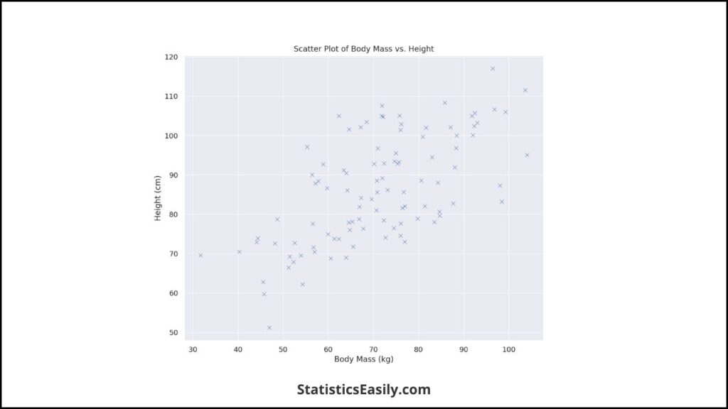
The scatter plot above, created from a dataset simulating the relationship between body mass and height, is a perfect starting point for linear regression analysis. It provides a visual foundation for applying a linear model and extracting insights, exemplifying how visual tools are essential for practical statistical analysis. Visualizing our data allows us to communicate results better, share insights, and make informed decisions.
Highlights
- Discover how R’s ‘lm()’ function calculates precise linear models.
- Visualize data relationships with custom plots in R.
- Master the interpretation of R’s regression output for applied analysis.
- Learn to enhance plots with R’s advanced graphical packages.
- Gain insights into R’s ‘abline()’ function for regression line representation.
Ad Title
Ad description. Lorem ipsum dolor sit amet, consectetur adipiscing elit.
Conceptual Foundation
Linear regression is finding the linear relationship between the dependent variable and one or more independent variables. The core concept behind linear regression is determining the best-fitting straight line through the data points. The regression equation represents this line:
y = β0 + β1x1 + β2x2 + … + βnxn + ϵ
where y is the dependent variable, β0 is the y-intercept, β1, …, βn are the coefficients, x1, …, xn are the independent variables, and ϵ represents the error term.
The importance of the relationship between dependent and independent variables in linear regression cannot be understated. The dependent variable, also known as the response or the predicted variable, is what we aim to predict or explain. The independent variables, also known as predictors or explanatory variables, are the inputs we use for prediction. The strength and form of the relationship are determined by the coefficients β1, …, βn, which signify how a unit change in the independent variable affects the dependent variable.
Understanding this relationship is critical because it forms the basis of the insights we can draw from the model. For instance, if we analyze the relationship between body mass (independent variable) and height (dependent variable), the coefficient tells us how much we would expect height to change, on average, with each additional kilogram of body mass.
In data analysis and science, these concepts are not just mathematical abstractions. They represent the profound interconnectivity of variables in natural phenomena and human-centric research. By unveiling these connections through linear regression analysis, we contribute to a body of knowledge that reflects the orderly and systematic nature of the universe, aligning with our pursuit of what is authentic and meaningful.
Setting up the Environment
Before delving into the analysis, setting up a proper environment in R is crucial for efficient and effective data plotting. Here’s a step-by-step guide to getting your R environment ready for linear regression analysis and plotting:
1. Install R and RStudio:
- Download and install R from the Comprehensive R Archive Network (CRAN).
- Optionally, download and install RStudio, a powerful and user-friendly interface for R.
2. Open RStudio and Set Your Working Directory:
- Use ‘setwd(“your_directory_path”)’ to set your working environment where your data and scripts will be stored.
3. Update R and Install Packages:
- Update R to the latest version using ‘update.packages(ask=FALSE)’.
- Install the necessary packages using ‘install.packages()’. For linear regression plotting, start with ‘ggplot2’, ‘dplyr’, and ‘tidyr’ for data manipulation and ‘ggplot2’ for advanced plotting capabilities.
4. Load the Packages:
- Load the installed packages into the library with ‘library(package_name)’.
5. Check for Updates Regularly:
- Regularly check and update your packages to ensure compatibility and access to the latest features.
# Setting up the Working Directory
# Replace 'your_directory_path' with the path where you want to store your data and scripts
setwd("your_directory_path")

# Updating R packages
update.packages(ask = FALSE)

# Installing necessary packages for linear regression plotting
# ggplot2 for plotting, dplyr and tidyr for data manipulation
install.packages("ggplot2")
install.packages("dplyr")
install.packages("tidyr")

# Loading the packages into R
library(ggplot2)
library(dplyr)
library(tidyr)

# Check for updates regularly - This is just a reminder, as you'll run this when needed
# update.packages(ask = FALSE)
Data Preparation
Data preparation is a critical stage in linear regression analysis, where data is collected, cleaned, and transformed into a suitable format for analysis. This process often involves several steps to ensure the data’s integrity and relevance to the research question.
1. Data Collection:
- Collect data from reliable sources to ensure its accuracy and validity.
- Ensure the data collected is relevant to the variables of interest in the linear regression model.
2. Data Cleaning:
- Identify and handle missing values appropriately, whether by imputation or removal.
- Detect and correct errors or outliers that may skew the analysis.
3. Data Transformation:
- Convert data into the correct format for analysis, such as changing data types or normalizing scales.
- Create dummy variables for categorical data to be used in the regression model.
4. Data Exploration:
- Conduct exploratory data analysis (EDA) to understand the data’s distribution and identify patterns or anomalies.
- Use visualizations to spot trends, clusters, and outliers that may affect the regression model.
5. Data Splitting:
- If applicable, split the data into training and testing sets to validate the model’s predictive performance.
For our dataset, we consider the relationship between body mass (independent variable) and height (dependent variable). The data set comprises body mass measurements in kilograms and height in centimeters for a sample population. This dataset is ideal for demonstrating linear regression because it likely exhibits a linear relationship, as body mass and height are typically correlated in biological studies.
Plotting with R
Plotting in R combines art and science, offering tools to represent data for analysis and communication visually. Using R’s base plotting system, ggplot2, or other visualization packages, you can create informative and aesthetically pleasing plots. Let’s explore the basic plotting techniques in R and how to customize these plots effectively.
1. Base R Plotting:
Base R provides simple plotting functions quite powerful. The ‘plot()’ function is one of the most commonly used:
# Basic scatter plot with R's base plotting system
plot(x = dataset$body_mass, y = dataset$height,
     main = "Scatter Plot of Body Mass vs. Height",
     xlab = "Body Mass (kg)", ylab = "Height (cm)",
     pch = 19, col = "blue")
Here, ‘x‘ and ‘y‘ are the variables to be plotted, ‘main‘ is the plot’s title, ‘xlab‘ and ‘ylab‘ are labels for the x and y-axes, ‘pch‘ sets the type of point to use, and ‘col‘ determines the color of the points.
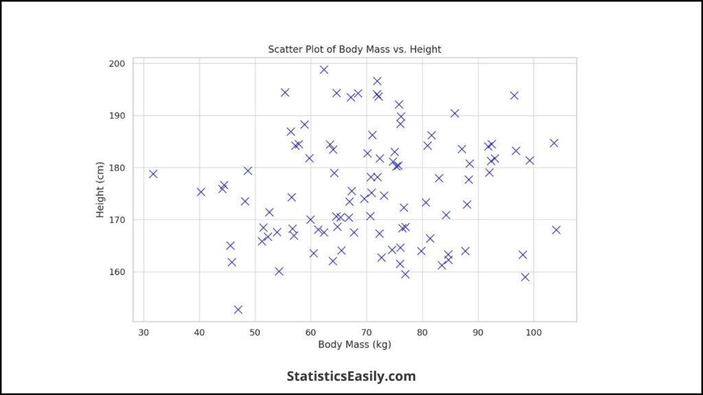
2. Customizing Plots
Customization involves changing default settings to make the plot convey information more effectively and to make it more visually appealing.
# Customizing the plot with additional arguments
plot(x = dataset$body_mass, y = dataset$height,
     main = "Scatter Plot of Body Mass vs. Height",
     xlab = "Body Mass (kg)", ylab = "Height (cm)",
     pch = 19, col = "blue", cex = 1.5,
     xlim = c(40, 100), ylim = c(140, 200))
Here, ‘cex‘ controls the size of the points, while ‘xlim‘ and ‘ylim‘ set the limits of the x and y axes, respectively.
3. Advanced Plotting with ‘ggplot2‘
‘ggplot2’ is a powerful system for creating graphics that provides more control over the plot’s aesthetics.
# Advanced plotting with ggplot2
library(ggplot2)

ggplot(data = dataset, aes(x = body_mass, y = height)) +
  geom_point(color = "blue") +
  ggtitle("Scatter Plot of Body Mass vs. Height") +
  xlab("Body Mass (kg)") +
  ylab("Height (cm)") +
  theme_minimal()
In this ‘ggplot‘ syntax, ‘aes‘ defines the aesthetic mappings, ‘geom_point‘ adds the scatter plot layer, ‘ggtitle‘, ‘xlab‘, and ‘ylab‘ provide titles and labels, and ‘theme_minimal()‘ applies a minimalistic theme to the plot.
Linear Regression Computation
The computation of a linear regression model in R is primarily conducted using the ‘lm()’ function, which stands for ‘linear model’. The ‘lm()‘ function fits a linear model to a data set by estimating the coefficients that result in the best fit, minimizing the sum of the squared residuals.
Here is how the ‘lm()‘ function is generally used:
# Fit a linear model to the data
linear_model <- lm(height ~ body_mass, data = dataset)

# Summarize the model to view the coefficients
summary(linear_model)
In the ‘lm()‘ function, ‘height ~ body_mass‘ specifies the model with ‘height‘ as the dependent variable and ‘body_mass‘ as the independent variable. The ‘data = dataset‘ argument tells R which data frame to use for the variables.
The ‘summary()’ function then provides a detailed output, including the estimated coefficients (intercept and slope), critical for understanding the regression equation. The output also includes statistical measures such as the R-squared value, which indicates the proportion of variance in the dependent variable that can be predicted from the independent variable.
Interpreting the coefficients is straightforward:
- Intercept (β0): This is the expected mean ‘height‘ value when ‘body_mass‘ is zero. It’s where the regression line crosses the Y-axis.
- Slope (β1): This represents the estimated change in ‘height‘ for a one-unit change in ‘body_mass‘. If ‘β1‘ is positive, it means that as ‘body_mass‘ increases, ‘height‘ tends to increase.
Understanding the regression equation is essential as it allows us to make predictions and understand the relationship between variables. For instance, if ‘β0‘ is 100 and ‘β1‘ is 0.5, the regression equation would be ‘height = 100 + 0.5 * body_mass’. For each additional kilogram of body mass, height is expected to increase by half a centimeter.
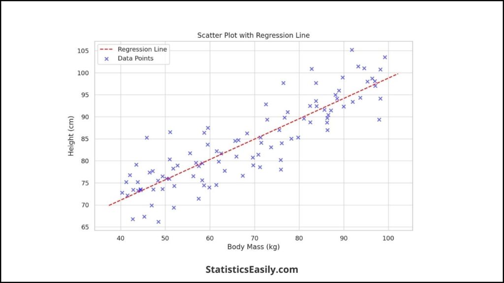
Visualizing the Regression Line
Visualizing the regression line is a crucial step in understanding the relationship your linear model represents. The regression line visually represents the linear equation fitted to your data. Here’s how you can add a regression line to your plots in R:
1. Using the abline() Function:
The ‘abline()’ function is a convenient tool in R’s base plotting system that allows you to add straight lines to a plot. After fitting a linear model using the ‘lm()’ function, add a regression line using the model’s intercept and slope.
# Assuming linear_model is your lm object from fitting the data
linear_model <- lm(height ~ body_mass, data = dataset)

# Basic scatter plot
plot(dataset$body_mass, dataset$height,
     main = "Scatter Plot with Regression Line",
     xlab = "Body Mass (kg)", ylab = "Height (cm)",
     pch = 19, col = "blue")

# Add the regression line
abline(linear_model, col = "red")
In this code, ‘abline(linear_model, col = “red”)’ automatically extracts the intercept and slope from your ‘linear_model’ object and adds a red regression line to your plot.
2. Using the lm() Directly with abline():
Alternatively, you can skip creating a linear model object and directly input the formula and dataset into ‘abline()’.
# Directly adding a regression line without storing the lm object
abline(lm(height ~ body_mass, data = dataset), col = "red")
This line of code performs the linear regression computation. It adds the regression line to the existing plot in one step.
Advanced Visualization Techniques
Enhancing your data visualizations goes beyond the basic plots. It involves leveraging the power of additional R packages and interactive plotting capabilities. These advanced techniques can significantly improve the engagement and interpretability of your data visualizations.
1. Utilizing ‘ggplot2’ for Advanced Customization:
‘ggplot2’ is a versatile package that allows for intricate and customizable plotting in R. With its layer-based approach, you can build plots piece by piece, adding aesthetic elements and statistical transformations.
library(ggplot2)

# Start with the basic plot
ggplot(dataset, aes(x = body_mass, y = height)) +
  geom_point() +  # Add points
  geom_smooth(method = "lm", se = FALSE, color = "red") +  # Add a linear regression line
  theme_bw() +  # Use a minimalistic theme
  labs(title = "Body Mass vs. Height with Regression Line",
       x = "Body Mass (kg)", y = "Height (cm)") +
  scale_color_manual(values = c("Points" = "blue", "Line" = "red"))
In this example, ‘geom_smooth(method = “lm”)’ adds a linear regression line directly to the plot, and ‘theme_bw()’ applies a minimalistic theme. ‘labs()’ labels the plot and axes, enhancing clarity and readability.
2. Creating Interactive Plots with ‘plotly’:
For a more engaging experience, especially in web-based environments, ‘plotly’ offers interactive plotting capabilities where users can hover over data points, zoom in/out, and pan across plots.
library(plotly)

# Convert ggplot2 to plotly
p <- ggplot(dataset, aes(x = body_mass, y = height)) +
  geom_point() +
  geom_smooth(method = "lm", se = FALSE, color = "red") +
  labs(title = "Interactive Plot of Body Mass vs. Height",
       x = "Body Mass (kg)", y = "Height (cm)")

# Convert to plotly object
ggplotly(p)
Converting a ‘ggplot2’ object to a ‘plotly’ object is straightforward and retains the layers and customizations added in ‘ggplot2’. The resulting interactive plot allows users to explore the data more dynamically, making the visualization a presentation tool and an exploratory device.
3. Enhancing Plots with ‘gganimate’ for Dynamic Visualizations:
‘gganimate’ extends ‘ggplot2’ by adding animation capabilities, making it possible to illustrate changes in data over time or conditions dynamically and compellingly.
library(gganimate)

# Assuming 'time' is a variable in your dataset
p <- ggplot(dataset, aes(x = body_mass, y = height, group = time)) +
  geom_line() +
  transition_reveal(time)

# Render the animation
animate(p, renderer = gifski_renderer())
This code snippet demonstrates creating a line plot that reveals itself over ‘time’, captivatingly showing progression, trends, or patterns evolving.
Interpreting Results
Interpreting the output from R, particularly from linear regression analysis, requires understanding the statistical summaries provided by functions like ‘summary()’ when applied to an ‘lm’ object. This output includes several vital components illuminating the relationship between variables and the model’s overall fit.
1. Coefficients:
- Intercept (β0): Represents the expected value of the dependent variable when all independent variables are zero. It’s the point where the regression line intersects the Y-axis.
- Slope (β1, β2, …): Each coefficient associated with an independent variable represents the expected change in the dependent variable for a one-unit change in that independent variable, holding all other variables constant.
2. Significance Levels:
- The stars or p-values next to the coefficients indicate their significance levels. A lower p-value (< 0.05) suggests that the corresponding variable significantly predicts the dependent variable.
3. R-squared (R²):
- This value indicates the proportion of variance in the dependent variable that is predictable from the independent variables. It ranges from 0 to 1, with higher values indicating a better fit of the model to the data.
4. F-statistic:
- This test evaluates the regression model’s overall significance and assesses whether at least one predictor variable has a non-zero coefficient.
Real-world Implications:
Understanding these results allows researchers and analysts to make informed decisions and predictions based on the model. For example, in a study examining the relationship between body mass and height:
- A significant positive coefficient for body mass suggests that height is also expected to increase as body mass increases, reflecting a direct relationship between these variables.
- A high R-squared value would indicate that a large proportion of the variability in height can be explained by variations in body mass, suggesting body mass is a good predictor of height.
- The overall model’s significance, as indicated by the F-statistic, supports using body mass to predict height in the studied population.
The interpretation extends beyond the numbers to consider the model’s applicability in real-world contexts. For instance, understanding the relationship between body mass and height can be crucial in health and nutrition, where such insights inform guidelines and interventions. However, it’s essential to consider the model’s limitations and the assumptions of linear regression, ensuring the findings are applied appropriately and thoughtfully in practice and policy-making.
In summary, interpreting the results from R’s linear regression analysis involves:
- A careful examination of the statistical output.
- Understanding the meaning and implications of coefficients.
- Significance levels.
- Model fit measures.
Ad Title
Ad description. Lorem ipsum dolor sit amet, consectetur adipiscing elit.
Conclusion
As we conclude our exploration of linear regression analysis and plotting lines in R, several vital takeaways reinforce best data analysis and representation practices. This journey through the statistical landscape has equipped us with technical skills and deepened our appreciation for the meticulous art of data science.
Firstly, the power of linear regression as a statistical tool is undeniable. It offers a window into the underlying patterns of our data, allowing us to predict outcomes and discern relationships between variables with precision. This technique, grounded in the principles of simplicity and clarity, mirrors our quest for understanding complex phenomena in a manner that is both accessible and profound.
Plotting in R, whether through base graphics or advanced packages like ‘ggplot2’, elevates our analysis from mere numbers to compelling narratives. These visual representations serve as analytical tools and bridges connecting data insights to real-world applications. They enable us to see beyond the surface, uncovering patterns and trends that might remain obscured.
The ‘lm()’ function, a cornerstone of linear modeling in R, embodies the elegance of statistical computation. Distilling complex relationships into simple equations reaffirms our belief in the pursuit of accurate and meaningful knowledge. Interpreting its output — coefficients, R-squared values, and p-values — guides us in making informed predictions and decisions rooted in a deep understanding of the data.
Advanced visualization techniques, including interactive plots and animations, push the boundaries of conventional data presentation. They invite engagement and curiosity, transforming passive observation into an active exploration. This dynamic approach to data visualization not only enhances understanding but also aligns with our commitment to fostering a deeper connection with the audience.
In interpreting the results from our linear models, we are reminded of the importance of context and critical thinking. The statistical significance and predictive power of our models must be weighed against real-world relevance and practical applicability. This balance between statistical rigor and real-world impact e
Recommended Articles
Explore deeper into data analysis—read our curated selection of articles on Linear Regression and R programming for more expert insights!
- How to Calculate Residuals in Regression Analysis?
- Assumptions in Linear Regression: A Comprehensive Guide
- How to Report Simple Linear Regression Results in APA Style
- What’s Regression Analysis? A Comprehensive Guide for Beginners
Frequently Asked Questions (FAQs)
Q1: What is linear regression analysis in R? It’s a statistical method for modeling the relationship between a scalar response and one or more explanatory variables.
Q2: How do I plot a regression line in R? Use the abline() function after computing a linear model with lm() to add a regression line to your plot.
Q3: What does the lm() function in R do? The lm() function fits linear models, calculating coefficients that represent the regression line equation.
Q4: Can R handle multiple regression analysis? R can perform multiple regression using lm(), allowing for several explanatory variables.
Q5: How do I interpret the coefficients in a linear model? Coefficients in a linear model indicate how much the dependent variable changes for a one-unit change in an independent variable.
Q6: What are some advanced plotting techniques in R? Advanced techniques include interactive plots with ggplot2 and plotly, and customizing plots with additional R packages.
Q7: Why is data visualization important in regression analysis? Visualization helps in understanding data trends, patterns, and the strength of relationships between variables.
Q8: What is the importance of the intercept in a regression line? The intercept is the expected mean value of Y when all X variables are zero. It’s the starting point of the regression line on the Y-axis.
Q9: How can I customize plots in R? Use arguments within the plot function like pch, cex, and col to change the appearance of points, their size, and color.
Q10: What is the best practice for preparing data for linear regression in R? Ensure data quality by cleaning, normalizing, and exploring data to understand its structure before applying regression analysis.