Histograms vs Bar Graphs in Data Visualization
You will learn the distinct functions and applications of histogram vs bar graph in data analysis.
Introduction
Data visualization is pivotal in modern data analysis, transforming complex numerical information into comprehensible visual formats. This process not only simplifies the interpretation of data but also uncovers patterns, trends, and insights that might otherwise remain hidden in raw numbers — among the various tools, histograms and bar graphs emerged as fundamental instruments.
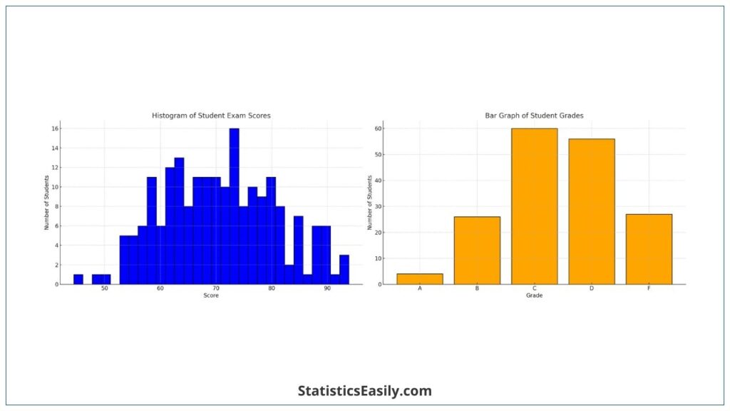
By its very nature, a histogram displays the frequency distribution of continuous data sets, providing a clear visual representation of data variation over a range. In contrast, bar graphs excel in the comparison of categorical data. They use rectangular bars to signify different categories, making them ideal for illustrating group comparisons.
The distinction between histograms vs bar graphs is not merely in their appearance but in the essence of the data they represent and their method of conveying information. Histograms, with their adjoining bars, reflect the continuous nature of the data, revealing patterns in data distribution. Bar graphs, separated by spaces, emphasize the distinctness of each category, allowing for an immediate visual comparison between different groups.
Highlights
- Histograms display frequency distributions of continuous data sets.
- Bar graphs compare categorical data with rectangular bars.
- Histogram bars touch each other, highlighting continuous data.
- Bar graph bars are separated, emphasizing distinct categories.
- Histograms and bar graphs have different axis representations.
Ad Title
Ad description. Lorem ipsum dolor sit amet, consectetur adipiscing elit.
What is a Histogram?
A histogram is a type of graph used in statistics to represent the distribution of numerical data. It is particularly effective in illustrating the frequency distribution of continuous data sets. In a histogram, data is grouped into ranges (known as bins), representing each bin by a bar. The height of each bar shows the number of data points that fall into each range.
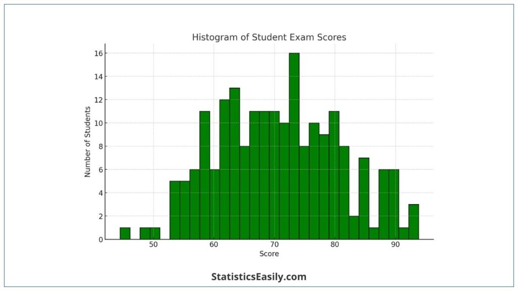
Histograms are widely used in various fields because they provide a visual summary of large data sets. In environmental science, for example, histograms might illustrate the distribution of temperature variations over a year. In finance, they can depict the frequency of returns on an investment.
These applications underscore the histogram’s strength in revealing underlying patterns such as central tendency, dispersion, and skewness in the data, making it an invaluable tool for data analysis. Its use helps understand the distribution and frequency of observed phenomena clearly and concisely.
What is a Bar Graph?
A bar graph is a visual representation used to compare and contrast categorical data. It consists of rectangular bars, where the length or height of each bar is proportional to the value or frequency of the category it represents. The key features of a bar graph include its ability to showcase discrete data clearly and its versatility in handling a variety of data types.
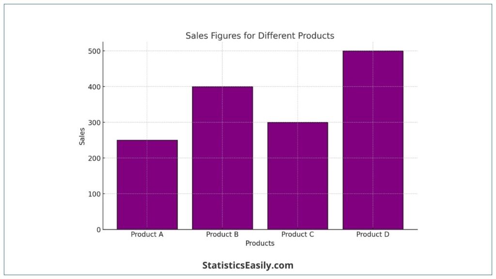
One of the primary uses of bar graphs is when data is divided into separate categories or groups; comparing these categories is necessary. For instance, a bar graph can effectively display the sales figures of different products in a company, enabling quick comparisons and insights into which products are performing well. Similarly, bar graphs can be used to compare the number of students enrolled in different courses in educational settings.
Bar graphs are most effective in scenarios where clarity in data presentation is essential. For example, they are ideal for representing survey results, such as the proportion of people favoring different political candidates or the popularity of various flavors in a food-tasting survey. The distinct separation between bars in a bar graph emphasizes the differences between categories, making it easy for the audience to discern the relative sizes of different groups.
The straightforward nature of bar graphs makes them an invaluable tool in data visualization, especially when communicating data insights to a general audience. Their precise, easily interpretable format aligns perfectly with the pursuit of presenting information that is not only true and informative but also accessible and engaging to the viewer.
Comparative Analysis
Data Representation: Continuous vs. Categorical Data
Histograms are primarily used for continuous data. They represent the distribution of a variable over a continuous interval, showcasing patterns like normal distribution or skewness. Each bar in a histogram corresponds to a range of data (a bin), and its height reflects the frequency of data within that bin.
Bar Graphs are suited for categorical data. They compare discrete categories, with each bar representing a different category. The height or length of the bar shows the value, count, or frequency of the category it represents.
Visual Structure and Layout
In Histograms, bars are placed adjacent to each other, emphasizing the continuity of the data. This layout helps in visualizing the shape of the data distribution.
Bar Graphs feature bars separated by spaces, highlighting the discrete nature of the categories. This separation makes it easier to compare individual categories at a glance.
| Aspect | Histogram | Bar Graph |
|---|---|---|
| Data Representation | Continuous data (variable distribution) | Categorical data (comparison between categories) |
| Visual Structure and Layout | Adjacent bars (no spaces), emphasizing data continuity | Bars separated by spaces, highlighting the discrete nature of categories |
| Typical Use Cases | Meteorology, finance, quality control | Marketing, public health, education |
Choosing the Right Tool
When to Use a Histogram
- Use a histogram when dealing with continuous data, especially when you need to show the distribution of a variable.
- Histograms are ideal for visualizing data where understanding the shape of the distribution is important, such as identifying skewness, peaks, or data spread.
- Examples include representing age distributions in a population, income levels, or time intervals.
When to Use a Bar Graph
- Choose a bar graph when your data is categorical or when comparing discrete groups.
- Bar graphs are perfect for highlighting differences between groups, making them suitable for data where each category is distinct and needs individual attention.
- Typical scenarios include comparing sales figures of different products, survey results (like customer preferences), or student performance in various subjects.
Considerations for Different Data Types and Research Questions
- For data that falls into clear, separate categories, a bar graph will more effectively communicate the differences between these groups.
- A histogram provides a more meaningful representation for data that measures frequencies or distributions within a continuous range.
- Always consider the research question: Are you trying to compare different groups or understand the distribution of a single group?
Ad Title
Ad description. Lorem ipsum dolor sit amet, consectetur adipiscing elit.
Conclusion
In conclusion, understanding histograms and bar graphs in data visualization brings us key takeaways. Each tool, with its unique capabilities and applications, plays a vital role in the interpretation and presentation of data.
Histograms are instrumental in illustrating the distribution of continuous data. They excel in revealing the underlying patterns in data sets, such as trends, peaks, and skewness, making them indispensable in areas like environmental studies, finance, and quality control.
Bar Graphs, on the other hand, are adept at comparing categorical data. Their ability to delineate differences between discrete groups makes them a favorite in marketing, public health, and education.
Recommended Articles
Discover more insightful articles on data visualization and analysis techniques on our blog. Expand your expertise today!
- Exploring Histogram Shapes: A Guide
- How To Select The Appropriate Graph?
- Left-Skewed and Right-Skewed Distributions
Frequently Asked Questions (FAQs)
Q1: What Defines the Scale of a Histogram? Histograms use interval scales to show continuous data distributions.
Q2: How Are Data Categories Represented in a Bar Graph? Bar graphs use individual bars to represent distinct categories or groups.
Q3: Can Histograms Be Used for Probability Distributions? Yes, histograms are effective in depicting probability distributions of continuous variables.
Q4: What Visual Elements Distinguish Bar Graphs? Bar graphs are distinguished by their separated bars, each representing a discrete category.
Q5: How Does Bin Width Affect a Histogram? Bin width in a histogram can alter the perception of data distribution, making it a critical choice.
Q6: Are There Types of Bar Graphs? Yes, there are several types, including clustered and stacked bar graphs, each serving different analytical needs.
Q7: How Do Histograms Handle Large Data Sets? Histograms can effectively manage large data sets, providing insights into distribution patterns.
Q8: What Role Do Axes Play in Bar Graphs? Axes in bar graphs are crucial for indicating the categories and their respective values or frequencies.
Q9: Can Histograms and Bar Graphs Be Combined? Combining these tools is unusual but can be done for complex data analyses requiring distribution and category comparisons.
Q10: What’s the Impact of Data Outliers in These Graphs? Outliers can significantly impact the interpretation of histograms and bar graphs, necessitating careful analysis.