Statistics And Fake News: A Deeper Look


Statistics and Fake News: Misusing statistical data fuels the spread of fake news, manipulating public perception by exploiting the credibility that numbers often confer.
Statistics hold immense power as a tool for understanding complex phenomena and making data-driven decisions. However, this power is like a double-edged sword when it falls into the hands of malicious individuals who exploit it to create and propagate fake news, lending credibility to their deceptive narratives.
Do you realize the extent to which the misuse of statistics can profoundly influence the acceptance and dissemination of fake news, masquerading as genuine information? Delve into this article to gain a deeper insight into statistics’ critical role in misinformation and deception!
At the heart of the fake news dilemma lies the deliberate fabrication of facts, where creators manipulate information to serve their specific agendas. By distorting reality, they prey on unsuspecting audiences, exploiting political, ideological, and financial subjects as primary targets.
Understanding the diverse motivations behind spreading fake news is crucial. Generally, those responsible for disseminating misinformation can be categorized into three distinct types:
(1) The Unwary: These individuals unknowingly share false “facts,” genuinely believing them to be true, making them easy targets for manipulation.
(2) The Biased: Such individuals may doubt the integrity of the content but choose to spread it out of personal convenience without taking the time to authenticate its integrity.
(3) The Malicious: This group is fully aware that the content is fake but continues disseminating it, driven by hidden interests and ulterior motives.
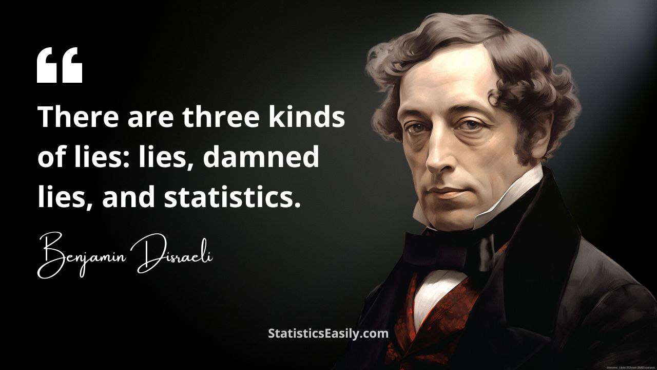
The potential dangers of misusing statistics are underscored by this quote attributed to former UK Prime Minister Benjamin Disraeli, which serves as a warning against the weaponization of data for harmful purposes:
This insightful observation highlights that, while powerful, statistics can be a deceptive force when wielded inappropriately, making them a cornerstone in constructing fake news.
But why do statistics hold such a vital role in fabricating fake news? The answer is relatively straightforward: those, who seek to deceive, know that statistics possess a unique ability to lend credibility to any content, thereby making their falsehoods appear more convincing to the unsuspecting public.
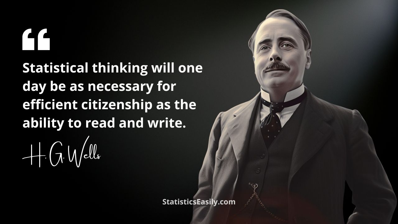
The prophetic words of the renowned British writer H. G. Wells ring more true today than ever before:
Regrettably, the day Wells foresaw is upon us. The pervasive use of statistics in fake news to bolster credibility necessitates an educated and discerning public.
To effectively fact-check content — particularly concerning its relationship to statistics — we must cultivate and sharpen our statistical thinking skills, as urged by Wells.
This endeavor is essential to develop the ability to read, interpret, and comprehend basic statistical information, such as graphs, summary measures, tables, and more.
When we’re equipped with these skills, unearthing statistical manipulations becomes a more manageable task.
We invite you to further explore our articles to enhance your statistical thinking skills! Additionally, a critical aspect of discerning the truth is scrutinizing information logically and skeptically, ensuring that you verify the reliability of the information source.
In the following sections, we will present examples of statistical manipulation techniques commonly employed in disseminating misinformation.
A blogger uses statistical, visual, and textual tricks to argue that the number of abortions in Portugal decreased dramatically after its legalization.
In addition to several issues in the text — such as omitting critical data that prevents a more profound analysis — he presents a misleading graph.
Here, we observe a common trick used in graphs to confuse the viewer: truncating the y-axis at the bottom.
Notice that the y-axis starts at 15,800, misleading the public into believing that a few years after 2008, the number of abortions dropped to zero.
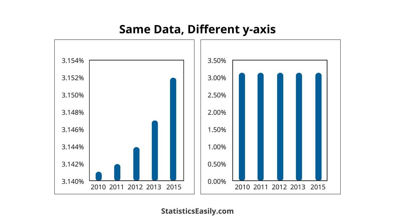
The graphs below demonstrate how axis manipulation can easily change our judgment. Note that both charts were constructed using the SAME data but on different y-axes — an entirely DIFFERENT pattern arises.
This technique inflates the data and conveys distorted ideas of reality, particularly to the unsuspecting.
Another crucial problem identified was that abortion legalization occurred between 2007 and 2008, precisely when the graph starts (x-axis), suppressing essential data from the years before legalization.
Furthermore, the population size, a vital variable for this type of analysis, was not considered.
We are not asserting that the number of abortions increased or decreased after legalization. Instead, we use this case as an example of improperly presented data intended to deceive the reader.
Scholastic MATH magazine published an article in September 2017 titled:
Fake News, Fake Data: How bad data and misleading graphs are fueling fake news.
In this article, the authors exemplify how small changes in graphs can easily mislead us.
In this example, we encounter the same issue as previously mentioned: the unnecessary truncation of the y-axis base.
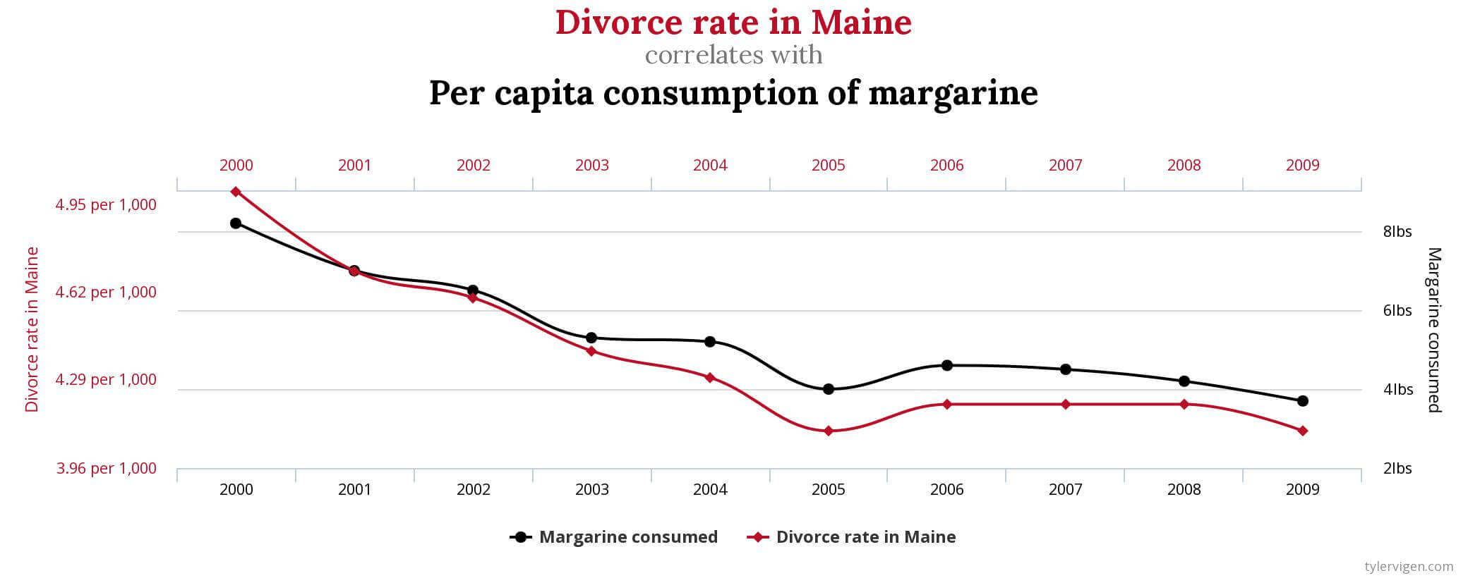
A website/book titled Spurious Correlations provides excellent examples to remind us of the adage: “Correlation does not imply causation.”
The phrase describes we cannot accurately determine a cause-and-effect link between two events or variables by observing their correlation or association.
The book contains several examples of highly correlated variables that clearly lack any causal relationship.
In one example, a nearly perfect 99% correlation was found between the variables “divorce rate in Maine” and “per capita consumption of margarine.”
In this extreme case, it should be evident that even if there is a very high correlation between two variables, this does not imply a causal relationship. In other words, one does not cause the other.
Other examples:
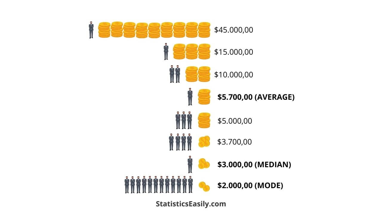
The following example illustrates how fake news creators can use different measures of central tendency to present information according to their needs.
The image demonstrates how the three most common central tendency measures might represent the average salary of workers in entirely different ways.
In this instance, the arithmetic mean yields a higher salary than the median and the mode.
This and many other examples of How To Lie With Statistics can be found in this classic book!
In January 2012, the Wall Street Journal published a graph proportionally comparing purchasing power in 1960 and 2000.
However, according to the presented values, the image on the left, published in the newspaper, showed misleading proportions — the correct graph is on the right.
Exploiting tools from a revered discipline like Statistics to disseminate ignorance and misinformation is a lamentable practice that must be resisted.
Statistics greatly influence fake news, lending credibility and facilitating its wide dissemination.
Cultivating statistical thinking and mastering statistical tools are vital in unveiling the true intentions behind any piece of content.
Being aware of the common tactics employed for such deception is crucial, encompassing:
(a) graphical distortions, (b) misrepresentation of summary measures, (c) ambiguous language, (d) erroneous claims of causality, (e) omission of crucial data or information, (f) visually deceptive scales and sizes, (g) drawing conclusions from small or biased samples.
Darrel Huff’s seminal work, How to Lie with Statistics, explores this subject matter excellently.
To conclude, we turn to a thought-provoking quote by Obi-Wan Kenobi to Luke Skywalker in Star Wars: Episode VI – Return of the Jedi:
“Luke, you will find that many of the truths to which we hold ourselves depend on our point of view.“

Discover 10 effective techniques to master statistics and data analysis, enhancing insightful, efficient learning skills.
Master the Chi Square Calculator to elevate your data analysis. This guide unpacks the tool’s utility in statistical testing and research.
Explore the transformative power of Statistical Learning in our comprehensive guide and become part of the data revolution.

Discover the role of cherry-picking in statistics, its real-world implications, and strategies to overcome this bias in our blog post.

Explore the nuances of accuracy, precision, recall, and F1 to select the best metric for evaluating your data model’s performance.

Explore the concept of Survivorship Bias, its impacts on data science, real-life cases, and strategies for detection and correction.