Box Plot: A Powerful Data Visualization Tool
A box plot is a graphical representation that illustrates a dataset’s key statistical measures — minimum, first quartile, median, third quartile, and maximum. It’s widely used in data analysis to visualize the distribution and skewness of data.
Introduction
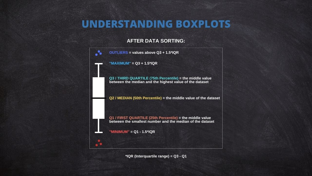
The Box Plot, aka Box and Whisker plot, is a graphical representation of a dataset’s five-number summary: minimum, first quartile (25th percentile), median (50th percentile), third quartile (75th percentile), and maximum. Developed by John Tukey in the 1970s, this plotting system has been recognized for its concise delivery of the distribution of a dataset, thus simplifying the data analysis process.
It’s a powerful tool in data analysis because it can clearly highlight the dataset’s central tendency, dispersion, and skewness. Moreover, it effectively visualizes outliers, providing a complete picture of the data distribution. This is particularly useful when comparing multiple datasets, as it offers a clear, comparative visualization of the different data distributions.
Highlights
- The Box Plot graphically represents five critical statistical measures of a dataset.
- The median in the box indicates the data’s central tendency.
- Quartiles Q1 and Q3, marking the box ends, reflect the data’s dispersion.
- The box plot’s whiskers reach the minimum and maximum non-outlier data points.
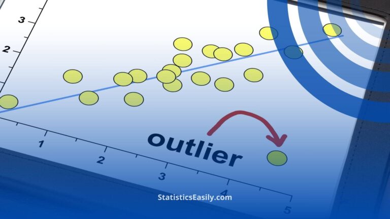
- Outliers are calculated as data points falling below (Q1 – 1.5IQR) or above (Q3 + 1.5IQR).
Ad Title
Ad description. Lorem ipsum dolor sit amet, consectetur adipiscing elit.
The Essential Components of a Box Plot
A Box Plot is a versatile tool that visually represents key statistical measures. It consists of several components, each providing distinct insights into the data distribution.
Central to the box plot is the median, represented by a line within the box. The second quartile (Q2) median is the middle value that separates the data into two halves. It measures central tendency, providing a snapshot of the data’s center.
Next, the box is defined by the first quartile (Q1) and the third quartile (Q3). These quartiles represent the 25th and 75th percentiles of the dataset, respectively. The Q1 mark represents the median of the first half of the data, while the Q3 represents the median of the second half.
The length of the box is the Inter Quartile Range (IQR), calculated by subtracting Q1 from Q3 (IQR = Q3 – Q1). The IQR measures the middle 50% of the data, measuring dispersion or spread.
The whiskers are lines extending from the box, reaching the minimum and maximum non-outlier data points. Usually, the lower whisker extends from Q1 to the smallest non-outlier data point, and the upper whisker extends from Q3 to the largest non-outlier data point.
Outliers are typically calculated as data points that fall below (Q1 – 1.5IQR) or above (Q3 + 1.5IQR). These outliers are represented as individual points outside the whiskers in the box plot.
Understanding these components of a box plot allows for rapid comprehension of the data’s distribution, spread, and skewness. It also aids in identifying and visualizing potential outliers, which can be invaluable in data analysis.
Generate Your Own Box Plots: An Interactive Tool
Follow these instructions to create your interactive box plot:
1. Number of Box Plots: Input the number of box plots you want to create.
2. X-axis Label: Enter the desired label for the X-axis.
3. Y-axis Label: Enter the desired label for the Y-axis.
For each box plot you want to generate, provide the following information:
4. Box-plot Name: Input a unique name for each box plot.
5. Box-plot Data: Enter the data for each box plot in the text area provided. Make sure to enter one data point per line.
Once inputting your data, click the “Update plot” button to generate your box plots.
Guide to Create a Box Plot on R
R is a go-to language in data science because of its statistical computation and graphic generation robustness. Let's take a quick tour of creating a Box Plot using R.
Firstly, install and load the ggplot2 package:
install.packages("ggplot2")

library(ggplot2)
Suppose you have a dataset and wish to create a box plot of a variable, var. The code snippet would be:
ggplot(data, aes(x = "", y = var)) +

  geom_boxplot() +

  theme(axis.title.x=element_blank())
This creates a simple box plot. To add more complexity or visual features, ggplot2 offers a other options that can be appended to this code.
Practical Applications of Box Plot
Box Plots find their usage in a wide range of real-world applications. For instance, box plots can be used in healthcare to compare the effectiveness of different drugs or treatments. They may be used in finance to compare the performance of other investment portfolios.
A powerful application of box plots is in A/B testing, where they can help determine if there's a significant difference between the groups. Furthermore, they're frequently used in exploratory data analysis for identifying outliers and understanding the data distribution.
The Versatility of Box Plots
While the traditional components of a Box Plot include the minimum, first quartile (Q1), median, third quartile (Q3), and maximum, it's worth noting that some statistical software offers flexibility in defining these measures.
For instance, specific programs allow replacing these traditional measures with others, such as mean, standard deviation (SD), confidence intervals (CI), etc. This adaptability will enable users to tailor their box plots to suit their specific analytical needs or preferences.
Thus, box plots remain not just a fundamental tool for data visualization but a versatile one that can be customized across different software platforms. Always review the documentation or the settings of your chosen statistical software to fully leverage these capabilities.
Common Misconceptions When Using Box Plot
Box Plots can sometimes be misinterpreted despite their utility, leading to flawed conclusions. A common misconception is to equate the box's length with the number of data points. In reality, it represents the data's spread.
Another error is in the interpretation of outliers. Outliers are not necessarily "bad" data points to be eliminated but may provide important insights about the dataset. Therefore, careful consideration is required before any decision to remove them.
Lastly, while box plots are efficient for summarizing data, they do not show the data's shape in detail, as a density plot or a histogram would. Therefore, they are best used with other data visualization tools for a more complete data analysis.
Ad Title
Ad description. Lorem ipsum dolor sit amet, consectetur adipiscing elit.
Recommended Articles
Interested in learning more about statistics and data analysis? Explore our blog for more articles and tutorials that will help you enhance your data skills!
- How To Select The Appropriate Graph?
- Create Great Graphs Easily (+Bonus)
- Which is Better, Mean or Median?
- Boxplots - an overview (External Link)
- How to Create Regression Lines in Excel
- Box Plot Skewness: A Visual Guide to Asymmetry
Frequently Asked Questions (FAQ)
It's a graphical representation of a five-number summary of a dataset: minimum, Q1, median, Q3, and maximum.
Box Plots provide a visual summary of data distribution. They are handy for identifying outliers and skewness in the data.
The box represents the IQR, covering 50% of data points from the first quartile (Q1) to the third quartile (Q3).
The line inside the box signifies the median, a measure of the data's central tendency.
Outliers are typically represented as individual points outside the whiskers in the box plot.
Outliers are usually calculated as data points that fall below (Q1 - 1.5IQR) or above (Q3 + 1.5IQR).
Some statistical software allows replacing traditional measures with others such as mean, standard deviation, confidence intervals, etc.
Whiskers extend from the box to the minimum and maximum non-outlier data points, thus showing the range of the data.
You can input your data and create a box plot with statistical software like R or Python or an interactive web tool.
Yes, Box Plots are widely used in fields like healthcare, finance, and A/B testing for quick visualization and interpretation of data.