
Box Plot Skewness: A Visual Guide to Asymmetry
For insightful statistical analysis, you will learn to interpret box plot skewness — asymmetry.
Introduction
The box plot stands as a cornerstone tool in statistical analysis, elegantly summarizing data through a simple yet informative visual. This article, “Box Plot Skewness: Decoding Asymmetry,” delves into the heart of box plots, illuminating their critical role in unveiling data stories.
Our focal point? Skewness is a concept that reveals how data stretches beyond the median, either leaning towards higher or lower values. Here, you will master the art of detecting skewness in box plots, a skill pivotal for any data analyst seeking deeper insights from numerical landscapes.
Highlights
- Box plots visually display median, quartiles, and outliers, which is crucial for skewness analysis.
- Asymmetry in box plots indicates skewed data, impacting data interpretation.
- Right-skewed box plots typically have longer right whiskers, signifying a higher data spread.
- Left-skewed box plots often reveal an accumulation of data points on the lower side.
- Understanding skewness in box plots aids in identifying data distribution patterns.
Ad Title
Ad description. Lorem ipsum dolor sit amet, consectetur adipiscing elit.
Understanding Box Plots
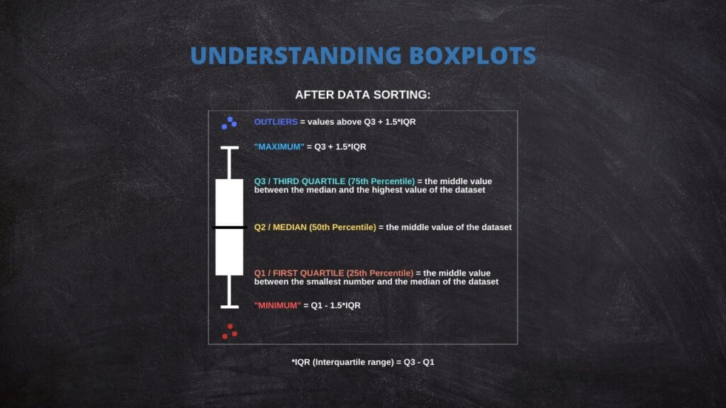
A box plot, also known as a box-and-whisker plot, is a standardized way of displaying data distribution based on a five-number summary: minimum, first quartile (Q1), median, third quartile (Q3), and maximum. It’s a visual snapshot that reveals a dataset’s central tendency, dispersion, and skewness.
Components of a Box Plot: A box plot consists of a box spanning from Q1 to Q3, encapsulating the interquartile range (IQR). The median, a critical measure of central tendency, is marked inside this box. Extending from the box, you find ‘whiskers’ that stretch out to the minimum and maximum values within 1.5 IQR from Q1 and Q3, providing a glimpse of the data spread. Points lying beyond these whiskers are considered outliers, highlighting extreme values in your dataset.
Constructing a Box Plot: To build a box plot, start by calculating your data’s median, Q1, and Q3. These quartiles divide your dataset into four equal parts, each representing an essential aspect of your data’s distribution. Next, plot these values on a scale, draw the box, and add the whiskers. Any data points beyond the whiskers should be individually plotted to identify outliers. This simple yet powerful representation gives immediate insights into your data’s skewness, symmetry, and dispersion.
Identifying Skewness in Box Plots
Skewness in distributions is a critical concept in statistics, revealing data asymmetry. This skewness is visually represented in box plots, offering insights into the distribution’s nature.
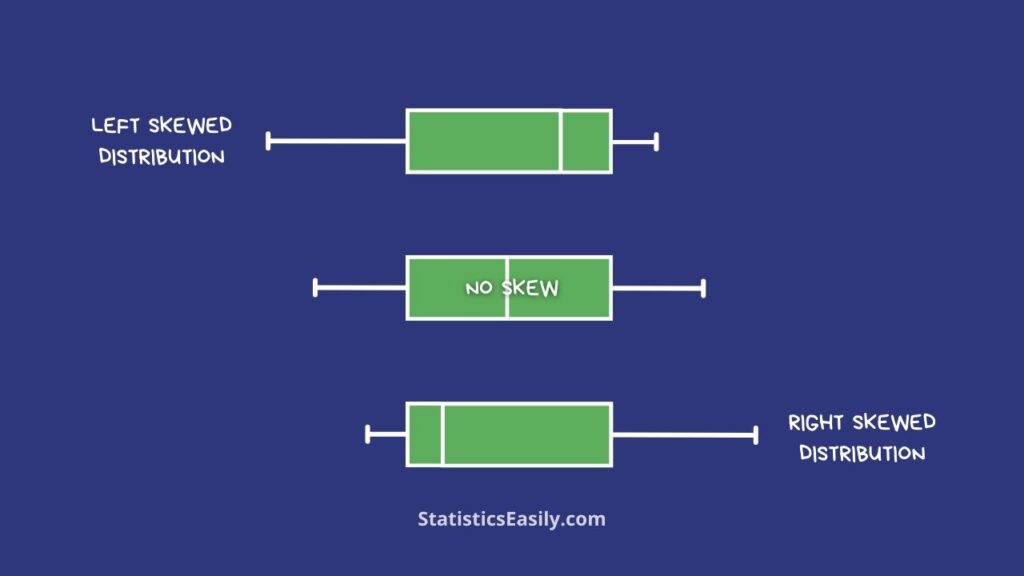
Right-Skewed Box Plots: These plots are characterized by a longer whisker on the right side, indicating a distribution with a tail stretching towards higher values. Most of the data lies on the lower side, but there are outliers or an extended range of higher values.
Left-Skewed Box Plots: Contrarily, left-skewed plots have a longer whisker on the left. This indicates that most data points are gathered towards the higher end, but there is a tail of lower values. The median and quartiles are pushed towards the higher end of the scale.
Symmetrical Distributions: When a box plot shows whiskers of equal length and the median is centrally located within the box, it suggests a symmetrical distribution. This ideal scenario indicates a balanced dataset with no significant skewness.
Practical Examples
In this section, we will explore real-world examples to illustrate different types of skewness in box plots, enhancing your understanding of how this concept applies in various data scenarios.
Income Distribution: A box plot representing income data often shows right-skewness, where the majority have incomes in the lower range, but there are significant outliers in the higher income bracket.
Age at Death: This example typically reveals a left-skewed box plot. Most people live up to a certain age, but a few live much longer, creating a tail on the higher age end.
Height Distribution: Height data usually form a symmetrical distribution in box plots, reflecting a balanced data set without significant skewness.
Each of these examples is a practical demonstration of how box plots can reveal the underlying nature of data, making them an invaluable tool in your statistical toolkit.
Interpreting Skewness: What Does it Tell Us?
Understanding skewness in box plots is not just about recognizing patterns; it’s about grasping their implications in data analysis and decision-making.
Implications of Skewness: Skewness in a dataset indicates more than just asymmetry; it suggests potential anomalies and outliers that could influence overall analysis. For instance, a right-skewed distribution might imply a majority of lower values with some extremely high values, affecting mean and median calculations.
Effect on Decision-Making: Recognizing skewness guides informed decisions. Understanding data distribution skewness in fields like finance or social sciences helps identify typical versus atypical phenomena, shaping policy-making or investment strategies.
Interpreting skewness is crucial for robust statistical analysis, ensuring that decisions are made on a comprehensive understanding of the data.
Ad Title
Ad description. Lorem ipsum dolor sit amet, consectetur adipiscing elit.
Conclusion
In this journey through “Box Plot Skewness: Decoding Asymmetry,” we’ve unlocked the secrets of box plots and their role in revealing data distribution. We’ve seen how skewness, whether right, left, or symmetrical, provides crucial insights into data characteristics. These insights are vital for accurate data analysis and informed decision-making. We encourage you to apply these concepts in your data analysis endeavors, enhancing your ability to effectively interpret and utilize statistical information. Remember, a box plot is more than a summary; it’s a window into the heart of your data.
Recommended Articles
Delve deeper into data insights! Explore our blog for more articles on statistical analysis and data science.
- Left-Skewed and Right-Skewed Distributions
- Box Plot: A Powerful Data Visualization Tool
- Descriptive vs. Inferential Statistics
Frequently Asked Questions (FAQs)
Q1: What is Box Plot Skewness? It’s the asymmetry in data distribution as visually represented in a box plot.
Q2: How Does a Box Plot Indicate Skewness? Through the length and position of the whiskers and the box’s alignment.
Q3: What is a Right-Skewed Box Plot? A plot with a longer right whisker indicates a spread towards higher values.
Q4: What Does a Left-Skewed Box Plot Show? It highlights more data points on the lower end, with a shorter right whisker.
Q5: Why is Identifying Skewness Important? It helps in understanding data distribution, which is critical for accurate analysis.
Q6: Can Box Plots Show Outliers? Yes, outliers are displayed as individual points outside the whiskers.
Q7: How Does Median Appear in a Skewed Box Plot? The median may be closer to one end of the box, indicating skewness.
Q8: Are Box Plots Useful for All Data Types? They are most effective for continuous data and less so for categorical data.
Q9: Can Skewness Affect Data Interpretation? Yes, skewness can lead to biased interpretations if not adequately considered.
Q10: How Can We Quantify Skewness? Skewness can be quantified using statistical measures like the skewness coefficient.