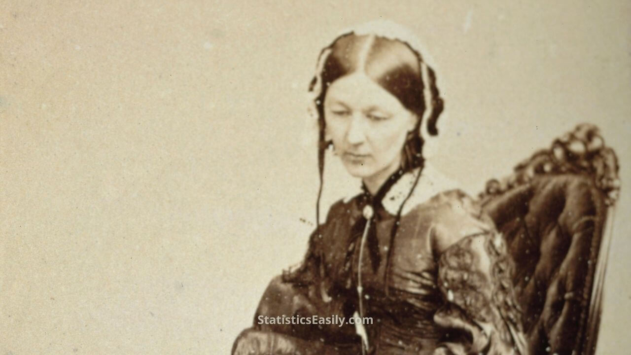
Florence Nightingale: How Data Visualization in the Form of Pie Charts Saved Lives
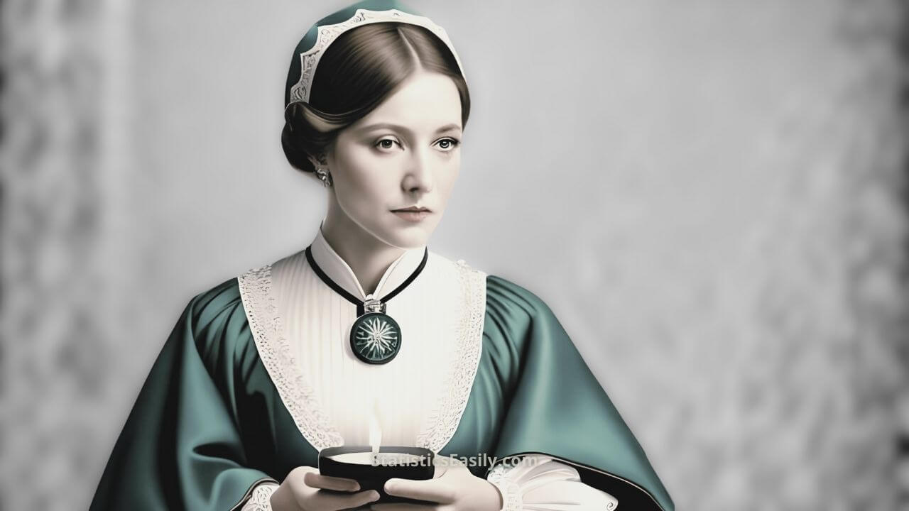
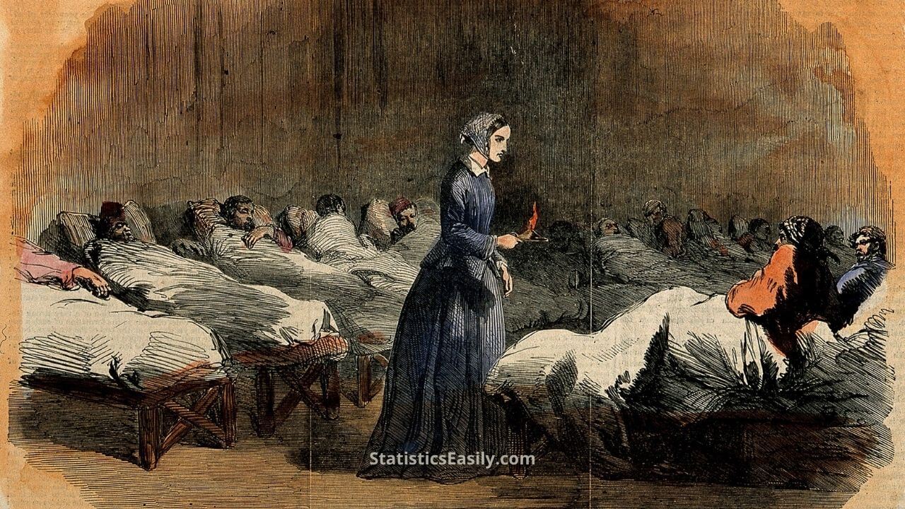
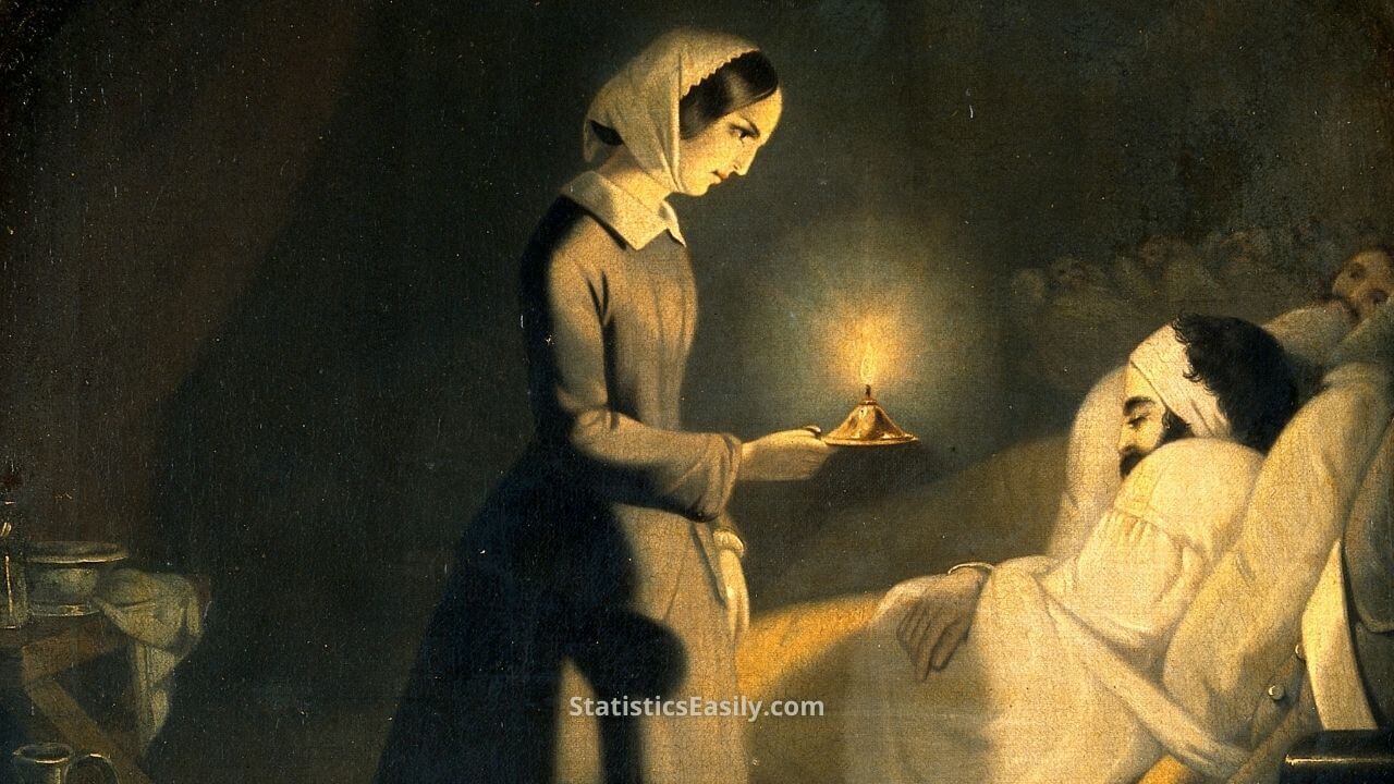
When the screams and cries of the wounded echoed through the blood-stained halls of the Scutari hospital during the Crimean War, a beacon of hope emerged. A figure, cloaked in the darkness of the night, was armed not with a sword but with a simple yet transformative tool: data visualization. This figure was Florence Nightingale, the Lady with the Lamp, and this is the story of how her innovative use of pie charts changed the course of history and saved countless lives.
Historical Background
In the mid-19th century, healthcare was more art than science. Data was seldom used for informed decision-making. Treatments and care were administered based on direct observation, anecdotal experience, and traditional practices, lacking statistical validation or strategic planning. This lack of a data-centric approach in healthcare was not unique to a particular region but was instead a common practice worldwide.
Enter the Crimean War. Fought from 1853 to 1856, it witnessed a cataclysm of casualties, most of whom were not the direct result of battle but rather the diseases that festered in the unsanitary conditions of the military hospitals. The death toll was enormous, with preventable diseases causing far more deaths than wounds from the battlefield. And it was here that the immense importance of health statistics and data utilization in healthcare was profoundly realized.
Highlights
- The mid-19th-century healthcare was predominantly based on traditional practices rather than data-driven decisions.
- Florence Nightingale used pie charts to illustrate the high mortality rates in war hospitals.
- Her data visualizations revealed the significant impact of poor sanitary conditions on mortality rates.
- The British government promptly reacted to Nightingale’s findings, establishing the Sanitary Commission in Scutari.
- Nightingale’s innovative use of data influenced multiple sectors beyond healthcare, emphasizing the importance of effective data visualization.
Ad Title
Ad description. Lorem ipsum dolor sit amet, consectetur adipiscing elit.
Florence Nightingale’s Contributions
Florence Nightingale‘s role extended beyond that of a nurse. She was a visionary, a statistician, and an innovator. Amid the chaos of the Crimean War, she saw beyond the status quo. She recognized the untapped potential of pie charts to illustrate the harsh realities of the war hospitals. She saw these charts not just as a tool for calculation but as an instrument of persuasion, a method to communicate the urgent need for sanitary reforms in healthcare settings.
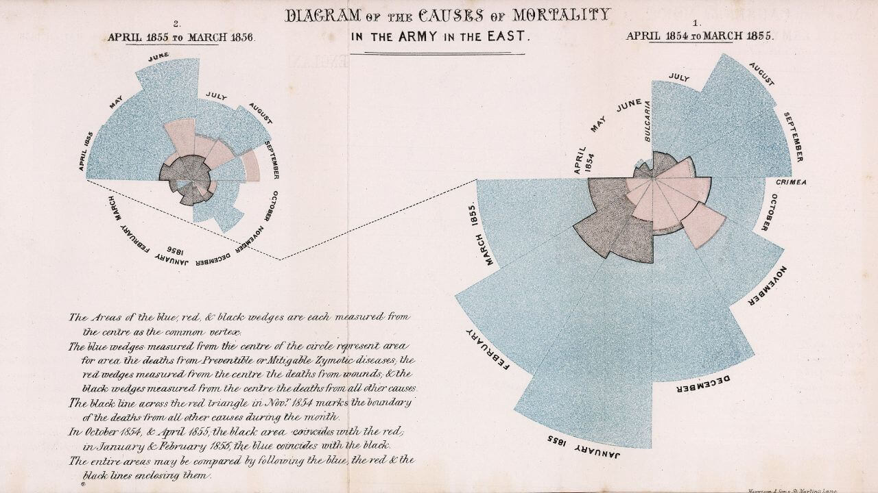
Nightingale meticulously collected data, scrutinizing the hospital records and gathering evidence to support her claim of hospitals’ dire need for better sanitary conditions. She then used this data to construct pie charts, a revolutionary approach. These weren’t ordinary pie charts but were polar area diagrams or “coxcombs,” as Nightingale termed them.
Visual Impact
Nightingale’s pie charts, or “Coxcombs” as she called them, weren’t just figures and percentages but visual stories. They painted a stark picture of the reality within war hospitals, bringing to life the urgent need for sanitary reforms. The charts were color-coded, with blue wedges indicating preventable diseases, red for wounds, and black for other causes. The larger the blue wedge, the more severe the conditions.
The visual representation of data allowed complex information to be quickly conveyed, making it clear even to those who weren’t statisticians. They communicated the message unambiguously – hygiene and sanitation were not etiquette matters but life and death. Through these diagrams, Nightingale demonstrated that more soldiers were dying from diseases related to poor hygiene than battlefield injuries.
In an era dominated by text, her pie charts were a revelation. They bypassed the need for lengthy explanations and hit straight to the issue’s core. They were compelling, persuasive, and ultimately instrumental in driving much-needed reforms in the healthcare field.
Key Findings
The insights that Florence Nightingale gleaned from her pie charts were met with initial resistance. The establishment was comfortable with its traditional ways of healthcare management, and the introduction of data to drive decisions was disruptive. Yet, the power of data visualization was hard to deny. Her “Coxcombs” were a striking testament to the severity of the situation — the high mortality rates were not predominantly from the battlefield but from preventable diseases in hospitals.
Through her innovative use of statistics and data visualization, Nightingale was able to showcase the extent of these preventable deaths. She unveiled that improved sanitary conditions could significantly decrease the death rate, and this insight was a profound paradigm shift for the medical establishment of that era.

Implications and Influence
The implications of Nightingale’s findings were swift and far-reaching. Upon revealing the impact of poor sanitary conditions in hospitals, the British government quickly set up the Sanitary Commission in Scutari, leading to a significant drop in the death rate. This immediate response was only the beginning.
Her work transformed healthcare practices and the world’s perception of data. Nightingale demonstrated that data could tell compelling stories and drive effective changes when effectively visualized. She showed that it was not enough to collect data; one must also be able to present it in a manner that people can understand and act upon.
This realization was not limited to the healthcare field. It permeated various sectors, embedding the importance of data visualization in policy-making, education, commerce, and more.
Legacy and Contemporary Relevance
Even today, in our data-driven world, Nightingale’s legacy endures. From the hospital rooms to the boardrooms, her principles of data visualization continue to inform and influence. Her pie charts may have evolved into more complex graphs and interactive dashboards. Still, the essence remains the same – using visuals to simplify complex data, reveal patterns, and drive decision-making.
Modern healthcare practitioners use data visualization to identify disease patterns, strategize treatments, and advocate for policy changes. Beyond healthcare, businesses harness visual data to gain competitive advantages, educators use it to facilitate learning, and policymakers employ it to make informed decisions.
Florence Nightingale wasn’t merely a nurse but a trailblazer whose impact transcended her time. She demonstrated the power of data visualization, leaving a relevant and influential legacy in our modern, data-intensive world. Her story is a testament to the powerful combination of data and empathy, reminding us of the profound changes we can drive when we use data to illuminate the truth and advocate for improvement.
Ad Title
Ad description. Lorem ipsum dolor sit amet, consectetur adipiscing elit.
Conclusion
Nightingale’s story is a testament to the power of data visualization. Her journey from the grim hospitals of the Crimean War to the statistical annals of healthcare reiterates one truth: when effectively presented, data can transform. Her use of pie charts, a simple tool by today’s standards, led to groundbreaking changes in healthcare practices and dramatically reduced mortality rates.
Florence Nightingale, the lady with the lamp, not only illuminated the dark corridors of war hospitals but also highlighted the importance of data in healthcare. She demonstrated that data is not merely numbers on a page, but a tool of advocacy, a means of communication, and a driver of change. Her innovative approach to data visualization and the results she achieved underscore the vital role of data in making informed decisions and affecting real-world change.
In today’s world, where data is abundantly available, Nightingale’s work is a potent reminder of the transformative power of data visualization. The principles she applied over a century ago still hold true. Even as technology advances and the volume of data we collect increases, the need to effectively communicate that data remains unchanged.
Call to Action
As we reflect on Nightingale’s story, I invite you to consider how data visualization can be harnessed in your field. Regardless of your profession, there is undoubtedly an abundance of data available. How can this data be visualized to reveal patterns, provide insights, or drive change?
Consider not just the data you have but also how you present it. Think about what ‘Coxcombs’ of our time might look like and how they could influence decision-making in your field. Remember, visualization is more than just creating charts; it’s about telling a story that can educate, inform, and inspire.
Whether you’re a healthcare professional, a business executive, an educator, or a policymaker, I challenge you to embrace the lessons from Nightingale’s journey. Harness the power of data visualization. Illuminate the truth. Advocate for improvement. And just as Nightingale did over a century ago, use data to transform your field and make a lasting impact.
Recommended Articles
If you found this exploration of Florence Nightingale’s impact on data visualization fascinating, I invite you to delve deeper into the realm of data science and its historical significance. Our blog features many articles on related topics that will undoubtedly pique your interest. Whether you’re a data enthusiast or a history buff, you’ll find insights and stories illuminating data’s power in our world. We have plenty of articles related to your search available at your convenience.
- Create Great Graphs Easily
- How To Lie With Statistics?
- Graph Selection Guide (Story)
- Why ‘Statistics Are Like Bikinis’
- The ‘Lady Tasting Tea’ Experiment
- How To Select The Appropriate Graph?
- Histograms vs Bar Graphs in Data Visualization
- Florence Nightingale – an overview (External Link)
- Scatterplot Mastery: Unveiling Patterns in Data Visualization
Frequently Asked Questions (FAQ)
She was a pioneering nurse and statistician known for her innovations in healthcare and her use of data visualization during the Crimean War.
Nightingale innovatively used pie charts to illustrate mortality rates in war hospitals, highlighting the dire impact of poor sanitary conditions.
Her pie charts helped convince the British government of the need for better hospital sanitation, leading to significant reductions in mortality rates.
Her findings led to improved hygiene standards in hospitals, not only during the war but also influencing subsequent healthcare practices worldwide.
Nightingale’s principles of data visualization continue to inform modern practices, with data-driven decisions now being fundamental across various sectors.
Her insights were initially met with resistance due to prevailing traditional practices in healthcare. However, the compelling nature of her visual data presentation overcame the skepticism.
‘Coxcombs’ was Nightingale’s name for the pie charts she used to visualize mortality data, which were instrumental in driving reforms in healthcare.
Her work underscores the enduring value of effective data visualization in driving informed decision-making and effecting real-world change, a principle still widely applied.
Nightingale showed that data is not merely numbers but a tool of advocacy and change, shaping how we perceive and use data today.
Her story teaches us the transformative power of data visualization and its potential to drive significant changes in various fields when effectively presented.