
Exploring Histogram Shapes: A Comprehensive Guide with Illustrations
Master the skill of Exploring Histogram Shapes, accurately identifying and interpreting various histogram shapes for deeper data insights and analysis.
Introduction
Histograms are fundamental tools in data analysis, offering a visual representation of numerical data by indicating the frequency of data points within specific ranges.
This article delves into the significance of different histogram shapes, including Bell-Shaped, Uniform, Bimodal, Multimodal, Left Skewed, Right Skewed, and Random distributions — each shape provides unique insights into the underlying distribution of data, revealing patterns and tendencies crucial for accurate data interpretation.
Understanding these shapes enhances our ability to analyze and describe data. It empowers us to make more informed decisions based on statistical evidence.
In this guide, we will explore the characteristics of these histogram shapes, their implications in various data sets, and how they can be effectively used in practical data analysis scenarios.
Highlights
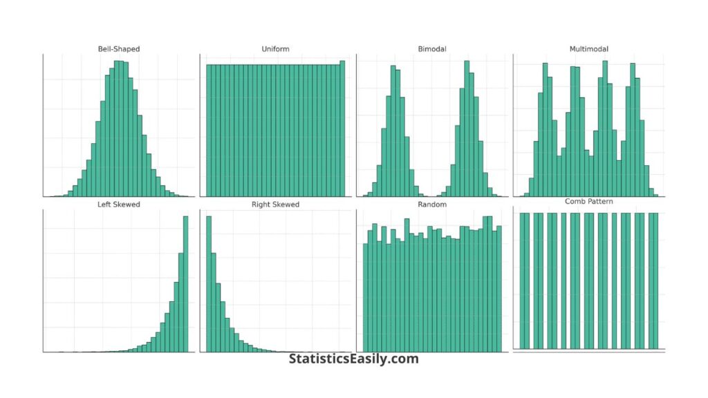
- Bell-shaped histograms often indicate a normal distribution in data sets.
- Uniform histograms reveal no prominent peaks, suggesting equal data distribution.
- Bimodal histograms have two distinct peaks, showing two data groupings.
- Multimodal histograms display multiple peaks, reflecting complex data patterns.
- Skewed histograms (left or right) highlight data asymmetry, revealing distribution biases.
Ad Title
Ad description. Lorem ipsum dolor sit amet, consectetur adipiscing elit.
Understanding Histogram Shapes:
Symmetrical Distributions
Bell-Shaped Histograms: These are pivotal in data analysis, often reflecting a normal distribution. This shape is characterized by data symmetrically distributed around a central peak, diminishing as it moves away from the center.
Uniform Histograms: Marked by evenly spaced bars of similar height, uniform histograms suggest data is uniformly distributed across the range. They’re crucial in identifying datasets with no distinct mode.
Asymmetrical Distributions
Left-Skewed Histograms: These histograms extend longer on the left, indicating a tail on the left side of the distribution. They are essential for identifying data sets with most values clustered on the right.
Right-Skewed Histograms: Characterized by a long tail on the right side, these histograms indicate that most of the data’s values are on the left, with a few higher values stretching to the right.
Complex Histogram Shapes:
Bimodal Histograms: These are characterized by two distinct peaks, each representing a different data grouping or distribution within the dataset. A classic example can be found in educational data, where test scores often form bimodal distributions, reflecting two different levels of understanding among students.
Multimodal Histograms: Histograms with more than two peaks fall under this category. They are indicative of data with multiple modes or categories. For instance, a multimodal histogram might reveal varying preferences or experiences among customer segments in a customer satisfaction survey.
Unusual Distributions:
Random Distribution Histograms: Random distribution histograms are characterized by bars of varying heights without a discernible pattern. This type of distribution typically occurs in datasets where the data points do not have any inherent order or relationship. An example scenario can be seen in environmental data, such as daily rainfall amounts in a region where weather patterns are highly unpredictable. In these cases, the histogram reflects the randomness inherent in the data, with no specific trend or predictable pattern. Understanding and identifying random distribution histograms are crucial in fields where data are influenced by a multitude of uncontrolled, external factors, as they offer insights into the inherent unpredictability present in the dataset.
Practical Applications
The various shapes of histograms have significant implications in different fields of data analysis:
- Healthcare: Bell-shaped histograms are often seen in medical data, indicating normal distributions of biological measurements. Understanding this shape helps in identifying typical vs. atypical patient health metrics.
- Finance: Skewed histograms, especially right-skewed, are common in financial data, reflecting income distribution or asset values. Recognizing these trends assists in risk assessment and financial planning.
- Environmental Studies: Random distribution histograms are crucial in environmental data, such as climate patterns or animal population studies, where data points can be highly unpredictable.
- Education: Bimodal histograms are frequently observed in test scores, indicating the presence of distinct student groups. This can guide educators in curriculum development and student support strategies.
- Market Research: Multimodal histograms in customer surveys reveal varied consumer preferences, aiding businesses in tailoring marketing strategies to different segments.
Ad Title
Ad description. Lorem ipsum dolor sit amet, consectetur adipiscing elit.
Conclusion
In this comprehensive exploration of histogram shapes, we’ve underscored their critical role in data interpretation across various fields. From the symmetry of bell-shaped and uniform distributions to the distinctive patterns of bimodal and multimodal histograms, each shape offers a unique lens through which to view and understand data.
Skewed distributions and the randomness of specific histograms further enrich our understanding. The ability to correctly identify and interpret these shapes is not just a statistical skill but a gateway to deeper insights in healthcare, finance, education, environmental studies, and market research.
Recommended Articles
Delve deeper into the world of data analysis by exploring more insightful articles on our blog. Discover a wealth of knowledge that awaits you!
- Left-Skewed and Right-Skewed Distributions
- Box Plot: A Powerful Data Visualization Tool
- Understanding Normal Distribution
Frequently Asked Questions (FAQs)
Q1: What defines a bell-shaped histogram? A histogram resembling a bell curve typically indicates a normal data distribution.
Q2: What does a uniform histogram look like? Uniform histograms display evenly distributed data, with bars of similar height across the range.
Q3: What is a bimodal histogram? Bimodal histograms have two distinct peaks, suggesting two different dataset groupings.
Q4: What are multimodal histograms? These histograms show multiple peaks, indicating complex data sets with several modes.
Q5: How do we identify a left-skewed histogram? A left-skewed histogram extends to the left, showing a tail on the left side.
Q6: What characterizes a right-skewed histogram? In right-skewed histograms, data extends more toward the right, with a longer right tail.
Q7: What does a random distribution in histograms imply? It suggests data points are randomly distributed without any discernible pattern.
Q8: Why is understanding histogram shapes important? Knowing histogram shapes aids in correctly interpreting data distributions and trends.
Q9: Can histogram shapes predict data behavior? Yes, they can offer insights into data tendencies and potential outliers.
Q10: How do outliers affect histogram shapes? Outliers can skew the histogram, misrepresenting the general data trend.